
Data visualisation: Is 'interesting' enough?
I recently read a blog post by Julian Boot titled 'visualisation without analysis is fine' where he suggests that we can learn things from visualising data in the right way - detailed statistical analysis isn’t always necessary.
I thought this was quite an interesting observation because over the past couple of months I’ve been playing around with ThoughtWorks data and looking at different ways to visualise aspects of the data.
For example the following visualisation shows the strength of colleague relationships between the various ThoughtWorks offices:
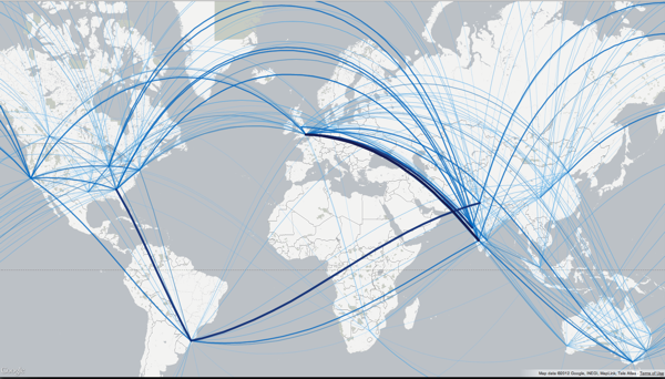
We can learn some interesting things from looking at it such as:
-
There’s a very strong connection between Bangalore and London
-
There’s also a very strong connection between Porto Alegre and Delhi/Dallas
-
If we look a bit closer we can see the connections from China aren’t as strong - there’s a reasonable link to San Francisco and weaker ones to Australia but not so much to other countries.
If we know more about the domain then we’d know that there are some distributed projects going on between Porto Alegre and the other two places and there are currently quite a lot of people from Bangalore working in London.
Although these observations are quite interesting I’m not sure if they are anything more than that.
In my opinion the intent of visualisations is to provoke some sort of action by helping people see something in the data which they couldn’t see before.
In Julian’s post he refers to a visualisation showing the colours used in movie posters and how there’s a trend towards a 50/50 split between orange and blue.
It’s really interesting to look at but as Julian points out it’s well known that movie posters make heavy use orange and blue and presumably at some stage someone has already worked out that these are the two most effective colours.
In my example most people I talked to were able to predict where the strongest connections would be before I showed them the visualisation.
My current thinking is that if a visualisation is only 'interesting' then perhaps I haven’t played around with the data enough to find some insight that would actually lead to an outcome/improvement of some sort.
I’m definitely interested in hearing others opinions/experienced in this area though!
About the author
I'm currently working on short form content at ClickHouse. I publish short 5 minute videos showing how to solve data problems on YouTube @LearnDataWithMark. I previously worked on graph analytics at Neo4j, where I also co-authored the O'Reilly Graph Algorithms Book with Amy Hodler.