
R: ggplot - Don't know how to automatically pick scale for object of type difftime - Discrete value supplied to continuous scale
While reading 'Why The R Programming Language Is Good For Business' I came across Udacity’s 'Data Analysis with R' courses - part of which focuses exploring data sets using visualisations, something I haven’t done much of yet.
I thought it’d be interesting to create some visualisations around the times that people RSVP 'yes' to the various Neo4j events that we run in London.
I started off with the following query which returns the date time that people replied 'Yes' to an event and the date time of the event:
library(Rneo4j)
query = "MATCH (e:Event)<-[:TO]-(response {response: 'yes'})
         RETURN response.time AS time, e.time + e.utc_offset AS eventTime"
allYesRSVPs = cypher(graph, query)
allYesRSVPs$time = timestampToDate(allYesRSVPs$time)
allYesRSVPs$eventTime = timestampToDate(allYesRSVPs$eventTime)

> allYesRSVPs[1:10,]
                  time           eventTime
1  2011-06-05 12:12:27 2011-06-29 18:30:00
2  2011-06-05 14:49:04 2011-06-29 18:30:00
3  2011-06-10 11:22:47 2011-06-29 18:30:00
4  2011-06-07 15:27:07 2011-06-29 18:30:00
5  2011-06-06 20:21:45 2011-06-29 18:30:00
6  2011-07-04 19:49:04 2011-07-27 19:00:00
7  2011-07-05 16:40:10 2011-07-27 19:00:00
8  2011-08-19 07:41:10 2011-08-31 18:30:00
9  2011-08-24 12:47:40 2011-08-31 18:30:00
10 2011-08-18 09:56:53 2011-08-31 18:30:00
I wanted to create a bar chart showing the amount of time in advance of a meetup that people RSVP’d 'yes' so I added the following column to my data frame:
allYesRSVPs$difference = allYesRSVPs$eventTime - allYesRSVPs$time

> allYesRSVPs[1:10,]
                  time           eventTime    difference
1  2011-06-05 12:12:27 2011-06-29 18:30:00 34937.55 mins
2  2011-06-05 14:49:04 2011-06-29 18:30:00 34780.93 mins
3  2011-06-10 11:22:47 2011-06-29 18:30:00 27787.22 mins
4  2011-06-07 15:27:07 2011-06-29 18:30:00 31862.88 mins
5  2011-06-06 20:21:45 2011-06-29 18:30:00 33008.25 mins
6  2011-07-04 19:49:04 2011-07-27 19:00:00 33070.93 mins
7  2011-07-05 16:40:10 2011-07-27 19:00:00 31819.83 mins
8  2011-08-19 07:41:10 2011-08-31 18:30:00 17928.83 mins
9  2011-08-24 12:47:40 2011-08-31 18:30:00 10422.33 mins
10 2011-08-18 09:56:53 2011-08-31 18:30:00 19233.12 mins
I then tried to use ggplot to create a bar chart of that data:
> ggplot(allYesRSVPs, aes(x=difference)) + geom_histogram(binwidth=1, fill="green")Unfortunately that resulted in this error:
Don't know how to automatically pick scale for object of type difftime. Defaulting to continuous
Error: Discrete value supplied to continuous scale
I couldn’t find anyone who had come across this problem before in my search but I did find the as.numeric function which seemed like it would put the difference into an appropriate format:
allYesRSVPs$difference = as.numeric(allYesRSVPs$eventTime - allYesRSVPs$time, units="days")
> ggplot(allYesRSVPs, aes(x=difference)) + geom_histogram(binwidth=1, fill="green")
that resulted in the following chart:
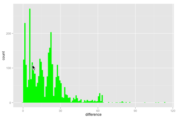
We can see there is quite a heavy concentration of people RSVPing yes in the few days before the event and then the rest are scattered across the first 30 days.
We usually announce events 3/4 weeks in advance so I don’t know that it tells us anything interesting other than that it seems like people sign up for events when an email is sent out about them.
The date the meetup was announced (by email) isn’t currently exposed by the API but hopefully one day it will be.
The code is on github if you want to have a play - any suggestions welcome.
About the author
I'm currently working on short form content at ClickHouse. I publish short 5 minute videos showing how to solve data problems on YouTube @LearnDataWithMark. I previously worked on graph analytics at Neo4j, where I also co-authored the O'Reilly Graph Algorithms Book with Amy Hodler.