
R: ggplot - Cumulative frequency graphs
In my continued playing around with ggplot I wanted to create a chart showing the cumulative growth of the number of members of the Neo4j London meetup group.
My initial data frame looked like this:
> head(meetupMembers)
  joinTimestamp            joinDate  monthYear quarterYear       week dayMonthYear
1  1.376572e+12 2013-08-15 13:13:40 2013-08-01  2013-07-01 2013-08-15   2013-08-15
2  1.379491e+12 2013-09-18 07:55:11 2013-09-01  2013-07-01 2013-09-12   2013-09-18
3  1.349454e+12 2012-10-05 16:28:04 2012-10-01  2012-10-01 2012-10-04   2012-10-05
4  1.383127e+12 2013-10-30 09:59:03 2013-10-01  2013-10-01 2013-10-24   2013-10-30
5  1.372239e+12 2013-06-26 09:27:40 2013-06-01  2013-04-01 2013-06-20   2013-06-26
6  1.330295e+12 2012-02-26 22:27:00 2012-02-01  2012-01-01 2012-02-23   2012-02-26
The first step was to transform the data so that I had a data frame where a row represented a day where a member joined the group. There would then be a count of how many members joined on that date.
We can do this with dplyr like so:
library(dplyr)
> head(meetupMembers %.% group_by(dayMonthYear) %.% summarise(n = n()))
Source: local data frame [6 x 2]

  dayMonthYear n
1   2011-06-05 7
2   2011-06-07 1
3   2011-06-10 1
4   2011-06-12 1
5   2011-06-13 1
6   2011-06-15 1
To turn that into a chart we can plug it into ggplot and use the cumsum function to generate a line showing the cumulative total:
ggplot(data = meetupMembers %.% group_by(dayMonthYear) %.% summarise(n = n()),
       aes(x = dayMonthYear, y = n)) +
  ylab("Number of members") +
  xlab("Date") +
  geom_line(aes(y = cumsum(n)))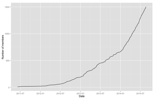
Alternatively we could bring the call to cumsum forward and generate a data frame which has the cumulative total:
> head(meetupMembers %.% group_by(dayMonthYear) %.% summarise(n = n()) %.% mutate(n = cumsum(n)))
Source: local data frame [6 x 2]

  dayMonthYear  n
1   2011-06-05  7
2   2011-06-07  8
3   2011-06-10  9
4   2011-06-12 10
5   2011-06-13 11
6   2011-06-15 12
And if we plug that into ggplot we’ll get the same curve as before:
ggplot(data = meetupMembers %.% group_by(dayMonthYear) %.% summarise(n = n()) %.% mutate(n = cumsum(n)),
       aes(x = dayMonthYear, y = n)) +
  ylab("Number of members") +
  xlab("Date") +
  geom_line()
If we want the curve to be a bit smoother we can group it by quarter rather than by day:
> head(meetupMembers %.% group_by(quarterYear) %.% summarise(n = n()) %.% mutate(n = cumsum(n)))
Source: local data frame [6 x 2]

  quarterYear   n
1  2011-04-01  13
2  2011-07-01  18
3  2011-10-01  21
4  2012-01-01  43
5  2012-04-01  60
6  2012-07-01 122
Now let’s plug that into ggplot:
ggplot(data = meetupMembers %.% group_by(quarterYear) %.% summarise(n = n()) %.% mutate(n = cumsum(n)),
       aes(x = quarterYear, y = n)) +
    ylab("Number of members") +
    xlab("Date") +
    geom_line()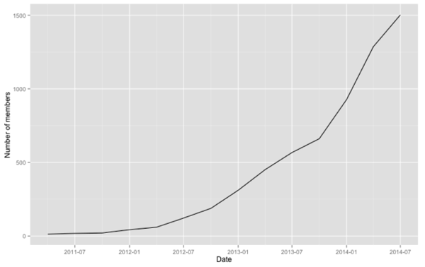
About the author
I'm currently working on short form content at ClickHouse. I publish short 5 minute videos showing how to solve data problems on YouTube @LearnDataWithMark. I previously worked on graph analytics at Neo4j, where I also co-authored the O'Reilly Graph Algorithms Book with Amy Hodler.