
R: ggplot - Plotting multiple variables on a line chart
In my continued playing around with meetup data I wanted to plot the number of members who join the Neo4j group over time.
I started off with the variable 'byWeek' which shows how many members joined the group each week:
> head(byWeek)
Source: local data frame [6 x 2]

        week n
1 2011-06-02 8
2 2011-06-09 4
3 2011-06-30 2
4 2011-07-14 1
5 2011-07-21 1
6 2011-08-18 1
I wanted to plot the actual count alongside a rolling average for which I created the following data frame:
library(zoo)
joinsByWeek = data.frame(actual = byWeek$n,
                         week = byWeek$week,
                         rolling = rollmean(byWeek$n, 4, fill = NA, align=c("right")))
> head(joinsByWeek, 10)
actual week rolling
1 8 2011-06-02 NA
2 4 2011-06-09 NA
3 2 2011-06-30 NA
4 1 2011-07-14 3.75
5 1 2011-07-21 2.00
6 1 2011-08-18 1.25
7 1 2011-10-13 1.00
8 2 2011-11-24 1.25
9 1 2012-01-05 1.25
10 3 2012-01-12 1.75The next step was to work out how to plot both 'rolling' and 'actual' on the same line chart. The easiest way is to make two calls to 'geom_line', like so:
ggplot(joinsByWeek, aes(x = week)) +
  geom_line(aes(y = rolling), colour="blue") +
  geom_line(aes(y = actual), colour = "grey") +
  ylab(label="Number of new members") +
  xlab("Week")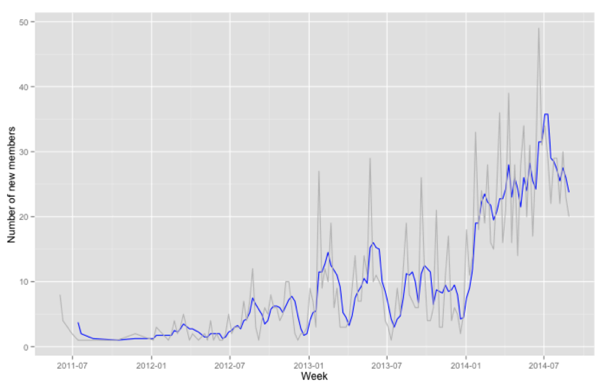
Alternatively we can make use of the 'melt' function from the http://www.statmethods.net/management/reshape.html library...
library(reshape)
meltedJoinsByWeek = melt(joinsByWeek, id = 'week')
> head(meltedJoinsByWeek, 20)
week variable value
1 1 actual 8
2 2 actual 4
3 3 actual 2
4 4 actual 1
5 5 actual 1
6 6 actual 1
7 7 actual 1
8 8 actual 2
9 9 actual 1
10 10 actual 3
11 11 actual 1
12 12 actual 2
13 13 actual 4
14 14 actual 2
15 15 actual 3
16 16 actual 5
17 17 actual 1
18 18 actual 2
19 19 actual 1
20 20 actual 2...which then means we can plot the chart with a single call to geom_line:
ggplot(meltedJoinsByWeek, aes(x = week, y = value, colour = variable)) +
  geom_line() +
  ylab(label="Number of new members") +
  xlab("Week Number") +
  scale_colour_manual(values=c("grey", "blue"))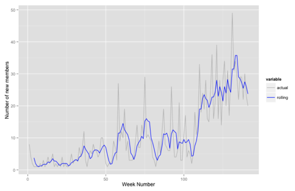
About the author
I'm currently working on short form content at ClickHouse. I publish short 5 minute videos showing how to solve data problems on YouTube @LearnDataWithMark. I previously worked on graph analytics at Neo4j, where I also co-authored the O'Reilly Graph Algorithms Book with Amy Hodler.