
Python/matpotlib: Plotting occurrences of the main characters in How I Met Your Mother
Normally when I’m playing around with data sets in R I get out ggplot2 to plot some charts to get a feel for the data but having spent quite a bit of time with Python and How I met your mother transcripts I haven’t created a single plot. I thought I’d better change change that.
After a bit of searching around it seems that matplotlib is the go to library for this job and I thought an interesting thing to plot would be how often each of the main characters appear in each episode across the show.
I’ve already got all the sentences from each episode as well as the list of episodes pulled out into CSV files so we can start from there.
This is a sample of the sentences file:
$ head -n 10 data/import/sentences.csv
SentenceId,EpisodeId,Season,Episode,Sentence
1,1,1,1,Pilot
2,1,1,1,Scene One
3,1,1,1,[Title: The Year 2030]
4,1,1,1,"Narrator: Kids, I'm going to tell you an incredible story. The story of how I met your mother"
5,1,1,1,Son: Are we being punished for something?
6,1,1,1,Narrator: No
7,1,1,1,"Daughter: Yeah, is this going to take a while?"
8,1,1,1,"Narrator: Yes. (Kids are annoyed) Twenty-five years ago, before I was dad, I had this whole other life."
9,1,1,1,"(Music Plays, Title ""How I Met Your Mother"" appears)"My first step was to transform the CSV file into an array of words grouped by episode. I created a dictionary, iterated over the CSV file and then used nltk’s word tokeniser to pull out words from sentences:
import csv
from collections import defaultdict
episodes = defaultdict(list)
with open("data/import/sentences.csv", "r") as sentencesfile:
reader = csv.reader(sentencesfile, delimiter = ",")
reader.next()
for row in reader:
episodes[row[1]].append([ word for word in nltk.word_tokenize(row[4].lower())] )Let’s have a quick look what’s in our dictionary:
>>> episodes.keys()[:10]
['165', '133', '132', '131', '130', '137', '136', '135', '134', '139']We’ve got some episode numbers as we’d expect. Now let’s have a look at some of the words for one of the episodes:
>>> episodes["165"][5]
['\xe2\x99\xaa', 'how', 'i', 'met', 'your', 'mother', '8x05', '\xe2\x99\xaa']So we’ve got an list of lists of words for each episode but gensim (which I wanted to play around with) requires a single array of words per document.
I transformed the data into the appropriate format and fed it into a gensim Dictionary:
from gensim import corpora
texts = []
for id, episode in episodes.iteritems():
texts.append([item for sublist in episode for item in sublist])
dictionary = corpora.Dictionary(texts)If we peek into 'texts' we can see that the list has been flattened:
>>> texts[0][10:20]
['a', 'bit', 'of', 'a', 'dog', ',', 'and', 'even', 'though', 'he']We’ll now convert our dictionary of words into a sparse vector which contains pairs of word ids and the number of time they occur:
corpus = [dictionary.doc2bow(text) for text in texts]Let’s try and find out how many times the word 'ted' occurs in our corpus. First we need to find out the word id for 'ted':
>>> dictionary.token2id["ted"]
551I don’t know how to look up the word id directly from the corpus but you can get back an individual document (episode) and its words quite easily:
>>> corpus[0][:5]
[(0, 8), (1, 1), (2, 2), (3, 13), (4, 20)]We can then convert that into a dictionary and look up our word:
>>> dict(corpus[0]).get(551)
16So 'ted' occurs 16 times in the first episode. If we generify that code we end up with the following:
words = ["ted", "robin", "barney", "lily", "marshall"]
words_dict = dict()
for word in words:
word_id = dictionary.token2id[word]
counts = []
for episode in corpus:
count = dict(episode).get(word_id) or 0
counts.append(count)
words_dict[word] = countsThere’s quite a lot of counts in there so let’s just preview the first 5 episodes:
>>> for word, counts in words_dict.iteritems():
print word, counts[:5]
lily [3, 20, 47, 26, 41]
marshall [8, 25, 63, 27, 34]
barney [9, 94, 58, 92, 102]
ted [16, 46, 66, 32, 44]
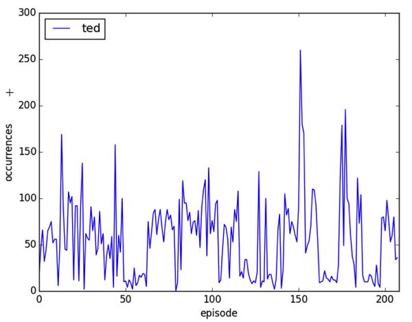
robin [18, 43, 25, 24, 34]Now it’s time to bring out matplotlib and make this visual! I initially put all the characters on one chart but it looks very messy and there’s a lot of overlap so I decided on separate charts.
The only thing I had to do to achieve this was call plt.figure() at the beginning of the loop to create a new plot:
import matplotlib
matplotlib.use('TkAgg')
import matplotlib.pyplot as plt
pylab.show()
for word, counts in words_dict.iteritems():
plt.figure()
plt.plot(counts)
plt.legend([word], loc='upper left')
plt.ylabel('occurrences')
plt.xlabel('episode')
plt.xlim(0, 208)
plt.savefig('images/%s.png' % (word), dpi=200)This generates plots like this:
This is good but I thought it’d be interesting to put in the season demarcations to see if that could give any more insight. We can call the function plt.axvline and pass in the appropriate episode number to achieve this effect but I needed to know the episode ID for the last episode in each season which required a bit of code:
import pandas as pd
df = pd.read_csv('data/import/episodes.csv', index_col=False, header=0)
last_episode_in_season = list(df.groupby("Season").max()["NumberOverall"])
>>> last_episode_in_season
[22, 44, 64, 88, 112, 136, 160, 184, 208]Now let’s plug that into matplotlib:
for word, counts in words_dict.iteritems():
plt.figure()
plt.plot(counts)
for episode in last_episode_in_season:
plt.axvline(x=episode, color = "red")
plt.legend([word], loc='upper left')
plt.ylabel('occurrences')
plt.xlabel('episode')
plt.xlim(0, 208)
plt.savefig('images/%s.png' % (word), dpi=200)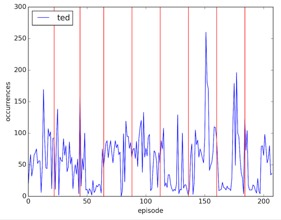
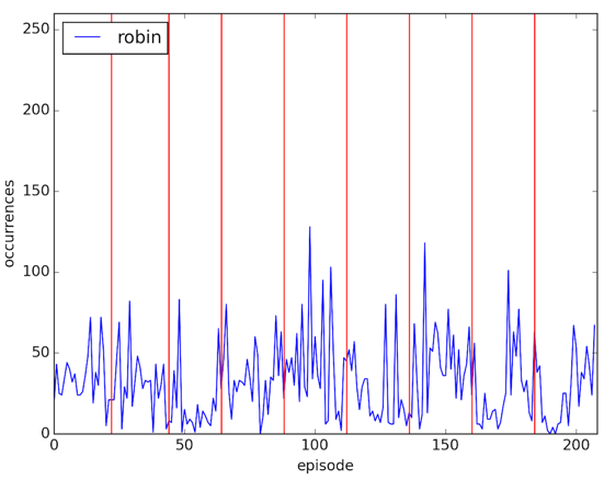
The last thing I wanted to do is get all the plots on the same scale for which I needed to get the maximum number of occurrences of any character in any episode. It was easier than I expected:
>>> y_max = max([max(count) for count in words_dict.values()])
>>> y_max
260And now let’s plot again:
for word, counts in words_dict.iteritems():
plt.figure()
plt.plot(counts)
for episode in last_episode_in_season:
plt.axvline(x=episode, color = "red")
plt.legend([word], loc='upper left')
plt.ylabel('occurrences')
plt.xlabel('episode')
plt.xlim(0, 208)
plt.ylim(0, y_max)
plt.savefig('images/%s.png' % (word), dpi=200)Our charts are now easy to compare:
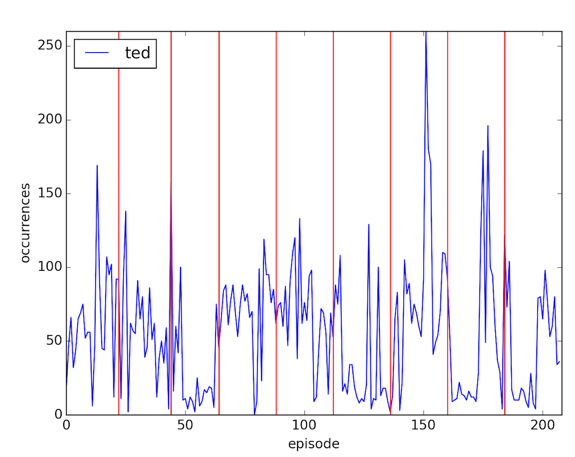
For some reason there’s a big spike of the word 'ted' in the middle of the 7th season - I’m clearly not a big enough fan to know why that is but it’s a spike of 30% over the next highest value.
The data isn’t perfect - some of the episodes list the speaker of the sentence and some don’t so it may be that the spikes indicate that rather than anything else.
I find it’s always nice to do a bit of visual exploration of the data anyway and now I know it’s possible to do so pretty easily in Python land.
About the author
I'm currently working on short form content at ClickHouse. I publish short 5 minute videos showing how to solve data problems on YouTube @LearnDataWithMark. I previously worked on graph analytics at Neo4j, where I also co-authored the O'Reilly Graph Algorithms Book with Amy Hodler.