
R: Weather vs attendance at NoSQL meetups
A few weeks ago I came across a tweet by Sean Taylor asking for a weather data set with a few years worth of recording and I was surprised to learn that R already has such a thing - the weatherData package.
Winner is: @UTVilla!
— Sean J. Taylor (@seanjtaylor) January 22, 2015
library(weatherData)
df <- getWeatherForYear("SFO", 2013)
ggplot(df, aes(x=Date, y = Mean_TemperatureF)) + geom_line()
weatherData provides a thin veneer around the wunderground API and was exactly what I’d been looking for to compare meetup at London’s NoSQL against weather conditions that day.
The first step was to download the appropriate weather recordings and save them to a CSV file so I wouldn’t have to keep calling the API.
I thought I may as well download all the recordings available to me and wrote the following code to make that happen:
library(weatherData)

# London City Airport
getDetailedWeatherForYear = function(year) {
  getWeatherForDate("LCY",
                    start_date= paste(sep="", year, "-01-01"),
                    end_date = paste(sep="", year, "-12-31"),
                    opt_detailed = FALSE,
                    opt_all_columns = TRUE)
}

df = rbind(getDetailedWeatherForYear(2011),
      getDetailedWeatherForYear(2012),
      getDetailedWeatherForYear(2013),
      getDetailedWeatherForYear(2014),
      getWeatherForDate("LCY", start_date="2015-01-01",
                        end_date = "2015-01-25",
                        opt_detailed = FALSE,
                        opt_all_columns = TRUE))
I then saved that to a CSV file:
write.csv(df, 'weather/temp_data.csv', row.names = FALSE)"Date","GMT","Max_TemperatureC","Mean_TemperatureC","Min_TemperatureC","Dew_PointC","MeanDew_PointC","Min_DewpointC","Max_Humidity","Mean_Humidity","Min_Humidity","Max_Sea_Level_PressurehPa","Mean_Sea_Level_PressurehPa","Min_Sea_Level_PressurehPa","Max_VisibilityKm","Mean_VisibilityKm","Min_VisibilitykM","Max_Wind_SpeedKm_h","Mean_Wind_SpeedKm_h","Max_Gust_SpeedKm_h","Precipitationmm","CloudCover","Events","WindDirDegrees"
2011-01-01,"2011-1-1",7,6,4,5,3,1,93,85,76,1027,1025,1023,10,9,3,14,10,NA,0,7,"Rain",312
2011-01-02,"2011-1-2",4,3,2,1,0,-1,87,81,75,1029,1028,1027,10,10,10,11,8,NA,0,7,"",321
2011-01-03,"2011-1-3",4,2,1,0,-2,-5,87,74,56,1028,1024,1019,10,10,10,8,5,NA,0,6,"Rain-Snow",249
2011-01-04,"2011-1-4",6,3,1,3,1,-1,93,83,65,1019,1013,1008,10,10,10,21,6,NA,0,5,"Rain",224
2011-01-05,"2011-1-5",8,7,5,6,3,0,93,80,61,1008,1000,994,10,9,4,26,16,45,0,4,"Rain",200
2011-01-06,"2011-1-6",7,4,3,6,3,1,93,90,87,1002,996,993,10,9,5,13,6,NA,0,5,"Rain",281
2011-01-07,"2011-1-7",11,6,2,9,5,2,100,91,82,1003,999,996,10,7,2,24,11,NA,0,5,"Rain-Snow",124
2011-01-08,"2011-1-8",11,7,4,8,4,-1,87,77,65,1004,997,987,10,10,5,39,23,50,0,5,"Rain",230
2011-01-09,"2011-1-9",7,4,3,1,0,-1,87,74,57,1018,1012,1004,10,10,10,24,16,NA,0,NA,"",242If we want to read that back in future we can do so with the following code:
weather = read.csv("weather/temp_data.csv")
weather$Date = as.POSIXct(weather$Date)

> weather %>% sample_n(10) %>% select(Date, Min_TemperatureC, Mean_TemperatureC, Max_TemperatureC)
           Date Min_TemperatureC Mean_TemperatureC Max_TemperatureC
1471 2015-01-10                5                 9               14
802  2013-03-12               -2                 1                4
1274 2014-06-27               14                18               22
848  2013-04-27                5                 8               10
832  2013-04-11                6                 8               10
717  2012-12-17                6                 7                9
1463 2015-01-02                6                 9               13
1090 2013-12-25                4                 6                7
560  2012-07-13               15                18               20
1230 2014-05-14                9                14               19
The next step was to bring the weather data together with the meetup attendance data that I already had.
For simplicity’s sake I’ve got those saved in a CSV file as we can just read those in as well:
timestampToDate <- function(x) as.POSIXct(x / 1000, origin="1970-01-01", tz = "GMT")

events = read.csv("events.csv")
events$eventTime = timestampToDate(events$eventTime)

> events %>% sample_n(10) %>% select(event.name, rsvps, eventTime)
                                                           event.name rsvps           eventTime
36                                   London Office Hours - Old Street    10 2012-01-18 17:00:00
137                                          Enterprise Search London    34 2011-05-23 18:15:00
256                           MarkLogic User Group London: Jim Fuller    40 2014-04-29 18:30:00
117                                  Neural Networks and Data Science   171 2013-03-28 18:30:00
210                                  London Office Hours - Old Street     3 2011-09-15 17:00:00
443                                                      July social!    12 2014-07-14 19:00:00
322                                                   Intro to Graphs    39 2014-09-03 18:30:00
203                                  Vendor focus: Amazon CloudSearch    24 2013-05-16 17:30:00
17  Neo4J Tales from the Trenches: A Recommendation Engine Case Study    12 2012-04-25 18:30:00
55                                                London Office Hours    10 2013-09-18 17:00:00
Now that we’ve got our two datasets ready we can plot a simple chart of the average attendance and temperature grouped by month:
byMonth = events %>%
  mutate(month = factor(format(eventTime, "%B"), levels=month.name)) %>%
  group_by(month) %>%
  summarise(events = n(),
            count = sum(rsvps)) %>%
  mutate(ave = count / events) %>%
  arrange(desc(ave))

averageTemperatureByMonth = weather %>%
  mutate(month = factor(format(Date, "%B"), levels=month.name)) %>%
  group_by(month) %>%
  summarise(aveTemperature = mean(Mean_TemperatureC))

g1 = ggplot(aes(x = month, y = aveTemperature, group=1), data = averageTemperatureByMonth) +
  geom_line( ) +
  ggtitle("Temperature by month")

g2 = ggplot(aes(x = month, y = count, group=1), data = byMonth) +
  geom_bar(stat="identity", fill="dark blue") +
  ggtitle("Attendance by month")

library(gridExtra)
grid.arrange(g1,g2, ncol = 1)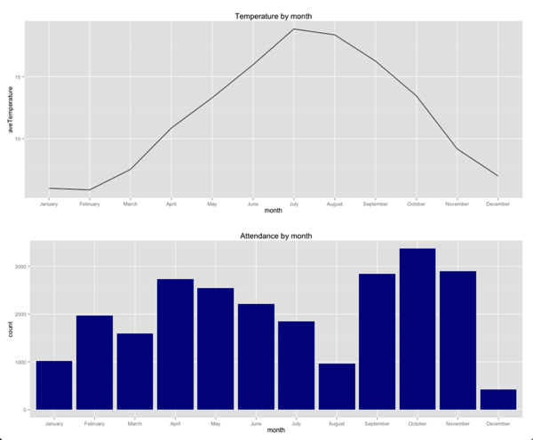
We can see a rough inverse correlation between the temperature and attendance, particularly between April and August - as the temperature increases, total attendance decreases.
But what about if we compare at a finer level of granularity such as a specific date? We can do that by adding a 'day' column to our events data frame and merging it with the weather one:
byDay = events %>%
  mutate(day = as.Date(as.POSIXct(eventTime))) %>%
  group_by(day) %>%
  summarise(events = n(),
            count = sum(rsvps)) %>%
  mutate(ave = count / events) %>%
  arrange(desc(ave))
weather = weather %>% mutate(day = Date)
merged = merge(weather, byDay, by = "day")
Now we can plot the attendance vs the mean temperature for individual days:
ggplot(aes(x =count, y = Mean_TemperatureC,group = day), data = merged) +
  geom_point()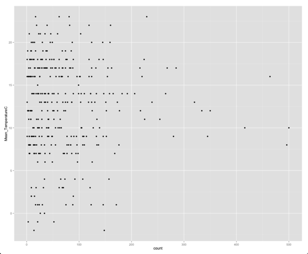
Interestingly there now doesn’t seem to be any correlation between the temperature and attendance. We can confirm our suspicions by running a correlation:
> cor(merged$count, merged$Mean_TemperatureC)
[1] 0.008516294
Not even 1% correlation between the values! One way we could confirm that non correlation is to plot the average temperature against the average attendance rather than total attendance:
g1 = ggplot(aes(x = month, y = aveTemperature, group=1), data = averageTemperatureByMonth) +
  geom_line( ) +
  ggtitle("Temperature by month")

g2 = ggplot(aes(x = month, y = ave, group=1), data = byMonth) +
  geom_bar(stat="identity", fill="dark blue") +
  ggtitle("Attendance by month")

grid.arrange(g1,g2, ncol = 1)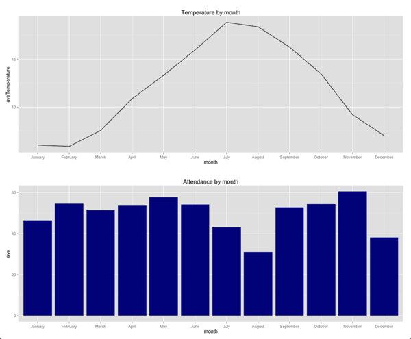
Now we can see there’s not really that much of a correlation between temperature and month - in fact 9 of the months have a very similar average attendance. It’s only July, December and especially August where there’s a noticeable dip.
This could suggest there’s another variable other than temperature which is influencing attendance in these months. My hypothesis is that we’d see lower attendance in the weeks of school holidays - the main ones happen in July/August, December and March/April (which interestingly don’t show the dip!)
Another interesting thing to look into is whether the reason for the dip in attendance isn’t through lack of will from attendees but rather because there aren’t actually any events to go to. Let’s plot the number of events being hosted each month against the temperature:
g1 = ggplot(aes(x = month, y = aveTemperature, group=1), data = averageTemperatureByMonth) +
  geom_line( ) +
  ggtitle("Temperature by month")

g2 = ggplot(aes(x = month, y = events, group=1), data = byMonth) +
  geom_bar(stat="identity", fill="dark blue") +
  ggtitle("Events by month")

grid.arrange(g1,g2, ncol = 1)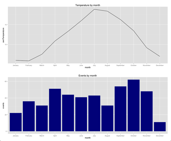
Here we notice there’s a big dip in events in December - organisers are hosting less events and we know from our earlier plot that on average less people are attending those events. Lots of events are hosted in the Autumn, slightly fewer in the Spring and fewer in January, March and August in particular.
Again there’s no particular correlation between temperature and the number of events being hosted on a particular day:
ggplot(aes(x = events, y = Mean_TemperatureC,group = day), data = merged) +
  geom_point()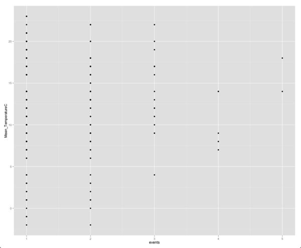
There’s not any obvious correlation from looking at this plot although I find it difficult to interpret plots where we have the values all grouped around very few points (often factor variables) on one axis and spread out (continuous variable) on the other. Let’s confirm our suspicion by calculating the correlation between these two variables:
> cor(merged$events, merged$Mean_TemperatureC)
[1] 0.0251698
Back to the drawing board for my attendance prediction model then!
If you have any suggestions for doing this analysis more effectively or I’ve made any mistakes please let me know in the comments, I’m still learning how to investigate what data is actually telling us.
About the author
I'm currently working on short form content at ClickHouse. I publish short 5 minute videos showing how to solve data problems on YouTube @LearnDataWithMark. I previously worked on graph analytics at Neo4j, where I also co-authored the O'Reilly Graph Algorithms Book with Amy Hodler.