
R: Cohort analysis of Neo4j meetup members
A few weeks ago I came across a blog post explaining how to apply cohort analysis to customer retention using R and I thought it’d be a fun exercise to calculate something similar for meetup attendees.
In the customer retention example we track customer purchases on a month by month basis and each customer is put into a cohort or bucket based on the first month they made a purchase in.
We then calculate how many of them made purchases in subsequent months and compare that with the behaviour of people in other cohorts.
In our case we aren’t selling anything so our equivalent will be a person attending a meetup. We’ll put people into cohorts based on the month of the first meetup they attended.
This can act as a proxy for when people become interested in a technology and could perhaps allow us to see how the behaviour of innovators, early adopters and the early majority differs, if at all.
The first thing we need to do is get the data showing the events that people RSVP’d 'yes' to. I’ve already got the data in Neo4j so we’ll write a query to extract it as a data frame:
library(RNeo4j)
graph = startGraph("http://127.0.0.1:7474/db/data/")

query = "MATCH (g:Group {name: \"Neo4j - London User Group\"})-[:HOSTED_EVENT]->(e),
               (e)<-[:TO]-(rsvp {response: \"yes\"})<-[:RSVPD]-(person)
         RETURN rsvp.time, person.id"

timestampToDate <- function(x) as.POSIXct(x / 1000, origin="1970-01-01", tz = "GMT")

df = cypher(graph, query)
df$time = timestampToDate(df$rsvp.time)
df$date = format(as.Date(df$time), "%Y-%m")
> df %>% head()
## rsvp.time person.id time date
## 612 1.404857e+12 23362191 2014-07-08 22:00:29 2014-07
## 1765 1.380049e+12 112623332 2013-09-24 18:58:00 2013-09
## 1248 1.390563e+12 9746061 2014-01-24 11:24:35 2014-01
## 1541 1.390920e+12 7881615 2014-01-28 14:40:35 2014-01
## 3056 1.420670e+12 12810159 2015-01-07 22:31:04 2015-01
## 607 1.406025e+12 14329387 2014-07-22 10:34:51 2014-07
## 1634 1.391445e+12 91330472 2014-02-03 16:33:58 2014-02
## 2137 1.371453e+12 68874702 2013-06-17 07:17:10 2013-06
## 430 1.407835e+12 150265192 2014-08-12 09:15:31 2014-08
## 2957 1.417190e+12 182752269 2014-11-28 15:45:18 2014-11Next we need to find the first meetup that a person attended - this will determine the cohort that the person is assigned to:
firstMeetup = df %>%
  group_by(person.id) %>%
  summarise(firstEvent = min(time), count = n()) %>%
  arrange(desc(count))

> firstMeetup
## Source: local data frame [10 x 3]
##
##    person.id          firstEvent count
## 1   13526622 2013-01-24 20:25:19     2
## 2  119400912 2014-10-03 13:09:09     2
## 3  122524352 2014-08-14 14:09:44     1
## 4   37201052 2012-05-21 10:26:24     3
## 5  137112712 2014-07-31 09:32:12     1
## 6  152448642 2014-06-20 08:32:50    17
## 7   98563682 2014-11-05 17:27:57     1
## 8  146976492 2014-05-17 00:04:42     4
## 9   12318409 2014-11-03 05:25:26     2
## 10  41280492 2014-10-16 19:02:03     5
Let’s assign each person to a cohort (month/year) and see how many people belong to each one:
firstMeetup$date = format(as.Date(firstMeetup$firstEvent), "%Y-%m")
byMonthYear = firstMeetup %>% count(date) %>% arrange(date)

ggplot(aes(x=date, y = n), data = byMonthYear) +
  geom_bar(stat="identity", fill = "dark blue") +
  theme(axis.text.x = element_text(angle = 45, hjust = 1))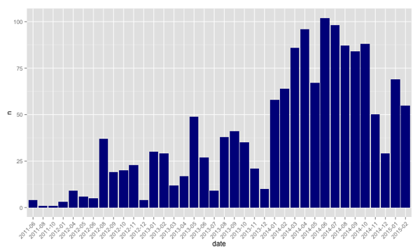
Next we need to track a cohort over time to see whether people keep coming to events. I wrote the following function to work it out:
countsForCohort = function(df, firstMeetup, cohort) {
  members = (firstMeetup %>% filter(date == cohort))$person.id

  attendance = df %>%
    filter(person.id %in% members) %>%
    count(person.id, date) %>%
    ungroup() %>%
    count(date)

  allCohorts = df %>% select(date) %>% unique
  cohortAttendance = merge(allCohorts, attendance, by = "date", all = TRUE)

  cohortAttendance[is.na(cohortAttendance) & cohortAttendance$date > cohort] = 0
  cohortAttendance %>% mutate(cohort = cohort, retention = n / length(members))
}
On the first line we get the ids of all the people in the cohort so that we can filter the data frame to only include RSVPs by these people. The first call to 'count' makes sure that we only have one entry per person per month and the second call gives us a count of how many people attended an event in a given month.
Next we do the equivalent of a left join using the merge function to ensure we have a row representing each month even if noone from the cohort attended. This will lead to NA entries if there’s no matching row in the 'attendance' data frame - we’ll replace those with a 0 if the cohort is in the future. If not we’ll leave it as it is.
Finally we calculate the retention rate for each month for that cohort. e.g. these are some of the rows for the '2011-06' cohort:
> countsForCohort(df, firstMeetup, "2011-06") %>% sample_n(10)
      date n  cohort retention
16 2013-01 1 2011-06      0.25
5  2011-10 1 2011-06      0.25
30 2014-03 0 2011-06      0.00
29 2014-02 0 2011-06      0.00
40 2015-01 0 2011-06      0.00
31 2014-04 0 2011-06      0.00
8  2012-04 2 2011-06      0.50
39 2014-12 0 2011-06      0.00
2  2011-07 1 2011-06      0.25
19 2013-04 1 2011-06      0.25
We could then choose to plot that cohort:
ggplot(aes(x=date, y = retention, colour = cohort), data = countsForCohort(df, firstMeetup, "2011-06")) +
  geom_line(aes(group = cohort)) +
  theme(axis.text.x = element_text(angle = 45, hjust = 1))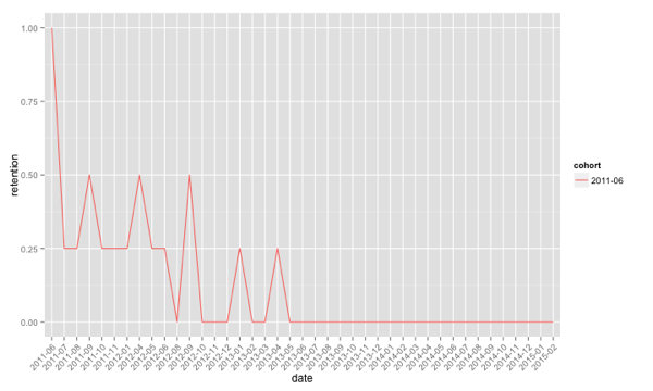
From this chart we can see that none of the people who first attended a Neo4j meetup in June 2011 have attended any events for the last two years.
Next we want to be able to plot multiple cohorts on the same chart which we can easily do by constructing one big data frame and passing it to ggplot:
cohorts = collect(df %>% select(date) %>% unique())[,1]

cohortAttendance = data.frame()
for(cohort in cohorts) {
  cohortAttendance = rbind(cohortAttendance,countsForCohort(df, firstMeetup, cohort))
}

ggplot(aes(x=date, y = retention, colour = cohort), data = cohortAttendance) +
  geom_line(aes(group = cohort)) +
  theme(axis.text.x = element_text(angle = 45, hjust = 1))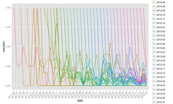
This all looks a bit of a mess and at the moment we can’t easily compare cohorts as they start at different places on the x axis. We can fix that by adding a 'monthNumber' column to the data frame which we calculate with the following function:
monthNumber = function(cohort, date) {
  cohortAsDate = as.yearmon(cohort)
  dateAsDate = as.yearmon(date)

  if(cohortAsDate > dateAsDate) {
    "NA"
  } else {
    paste(round((dateAsDate - cohortAsDate) * 12), sep="")
  }
}
Now let’s create a new data frame with the month field added:
cohortAttendanceWithMonthNumber = cohortAttendance %>%
  group_by(row_number()) %>%
  mutate(monthNumber = monthNumber(cohort, date)) %>%
  filter(monthNumber != "NA") %>%
  filter(monthNumber != "0") %>%
  mutate(monthNumber = as.numeric(monthNumber)) %>%
  arrange(monthNumber)
We’re also filtering out any 'NA' columns which would represent row entries for months from before the cohort started. We don’t want to plot those.
finally let’s plot a chart containing all cohorts normalised by month number:
ggplot(aes(x=monthNumber, y = retention, colour = cohort), data = cohortAttendanceWithMonthNumber) +
  geom_line(aes(group = cohort)) +
  theme(axis.text.x = element_text(angle = 45, hjust = 1), panel.background = element_blank())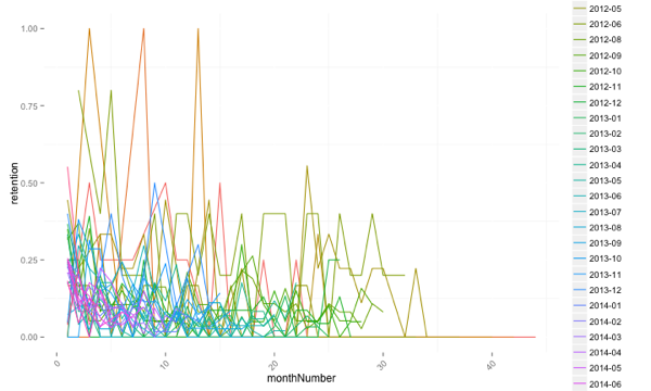
It’s still a bit of a mess but what stands out is that when the number of people in a cohort is small the fluctuation in the retention value can be quite pronounced.
The next step is to make the cohorts a bit more coarse grained to see if it reveals some insights. I think I’ll start out with a cohort covering a 3 month period and see how that works out.
About the author
I'm currently working on short form content at ClickHouse. I publish short 5 minute videos showing how to solve data problems on YouTube @LearnDataWithMark. I previously worked on graph analytics at Neo4j, where I also co-authored the O'Reilly Graph Algorithms Book with Amy Hodler.