
R: Neo4j London meetup group - How many events do people come to?
Earlier this week the number of members in the Neo4j London meetup group creeped over the 2,000 mark and I thought it’d be fun to re-explore the data that I previously imported into Neo4j.
How often do people come to meetups?
library(RNeo4j)
library(dplyr)

graph = startGraph("http://localhost:7474/db/data/")

query = "MATCH (g:Group {name: 'Neo4j - London User Group'})-[:HOSTED_EVENT]->(event)<-[:TO]-({response: 'yes'})<-[:RSVPD]-(profile)-[:HAS_MEMBERSHIP]->(membership)-[:OF_GROUP]->(g)
         WHERE (event.time + event.utc_offset) < timestamp()
         RETURN event.id, event.time + event.utc_offset AS eventTime, profile.id, membership.joined"

df = cypher(graph, query)

> df %>% head()
  event.id    eventTime profile.id membership.joined
1 20616111 1.309372e+12    6436797      1.307285e+12
2 20616111 1.309372e+12   12964956      1.307275e+12
3 20616111 1.309372e+12   14533478      1.307290e+12
4 20616111 1.309372e+12   10793775      1.307705e+12
5 24528711 1.311793e+12   10793775      1.307705e+12
6 29953071 1.314815e+12   10595297      1.308154e+12
byEventsAttended = df %>% count(profile.id)
> byEventsAttended %>% sample_n(10)
Source: local data frame [10 x 2]
profile.id n
1 128137932 2
2 126947632 1
3 98733862 2
4 20468901 11
5 48293132 5
6 144764532 1
7 95259802 1
8 14524524 3
9 80611852 2
10 134907492 2Now let’s visualise the number of people that have attended certain number of events:
ggplot(aes(x = n), data = byEventsAttended) +
  geom_bar(binwidth = 1, fill = "Dark Blue") +
  scale_y_continuous(breaks = seq(0,750,by = 50))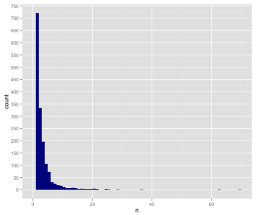
Most people come to one meetup and then there’s a long tail after that with fewer and fewer people coming to lots of meetups.
The chart has lots of blank space due to the sparseness of people on the right hand side. If we exclude any people who’ve attended more than 20 events we might get a more interesting visualisation:
ggplot(aes(x = n), data = byEventsAttended %>% filter(n <= 20)) +
  geom_bar(binwidth = 1, fill = "Dark Blue") +
  scale_y_continuous(breaks = seq(0,750,by = 50))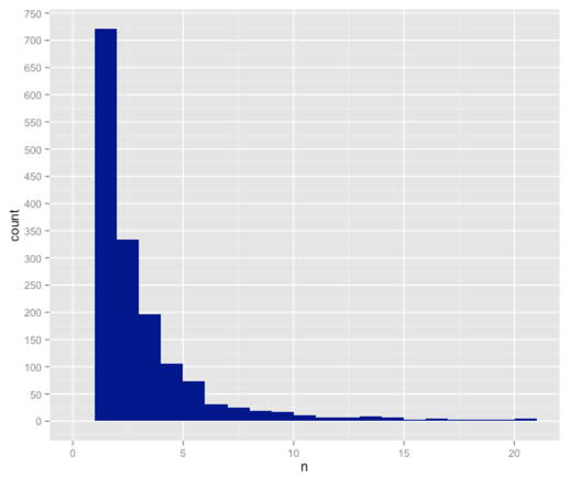
Nicole suggested a more interesting visualisation would be a box plot so I decided to try that next:
ggplot(aes(x = "Attendees", y = n), data = byEventsAttended) +
  geom_boxplot(fill = "grey80", colour = "Dark Blue") +
  coord_flip()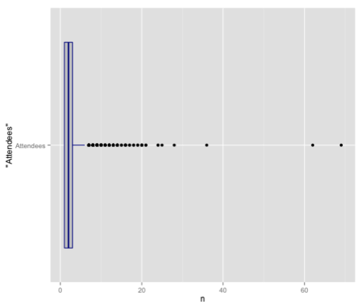
This visualisation really emphasises that the majority are between 1 and 3 and it’s much less obvious how many values there are at the higher end. A quick check of the data with the summary function reveals as much:
> summary(byEventsAttended$n)
   Min. 1st Qu.  Median    Mean 3rd Qu.    Max.
  1.000   1.000   2.000   2.837   3.000  69.000
Now to figure out how to move that box plot a bit to the right :)
About the author
I'm currently working on short form content at ClickHouse. I publish short 5 minute videos showing how to solve data problems on YouTube @LearnDataWithMark. I previously worked on graph analytics at Neo4j, where I also co-authored the O'Reilly Graph Algorithms Book with Amy Hodler.