
R: Cohort heatmap of Neo4j London meetup
A few months ago I had a go at doing some cohort analysis of the Neo4j London meetup group which was an interesting experiment but unfortunately resulted in a chart that was completely illegible.
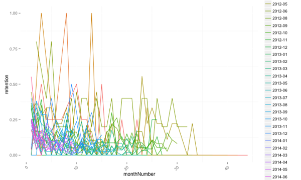
I wasn’t sure how to progress from there but a few days ago I came across the cohort heatmap which seemed like a better way of visualising things over time.
The underlying idea is still the same - we’ve comparing different cohorts of users against each other to see whether a change or intervention we did at a certain time had any impact.
However, the way we display the cohorts changes and I think for the better.
To recap, we start with the following data frame:
df = read.csv("/tmp/df.csv")
> df %>% sample_n(5)
        rsvp.time person.id                time    date
255  1.354277e+12  12228948 2012-11-30 12:05:08 2012-11
2475 1.407342e+12  19057581 2014-08-06 16:26:04 2014-08
3988 1.421769e+12  66122172 2015-01-20 15:58:02 2015-01
4411 1.419377e+12 165750262 2014-12-23 23:27:44 2014-12
1010 1.383057e+12  74602292 2013-10-29 14:24:32 2013-10
And we need to transform this into a data frame which is grouped by cohort (members who attended their first meetup in a particular month). The following code gets us there:
firstMeetup = df %>%
  group_by(person.id) %>%
  summarise(firstEvent = min(time), count = n()) %>%
  arrange(desc(count))
firstMeetup$date = format(as.Date(firstMeetup$firstEvent), "%Y-%m")

countsForCohort = function(df, firstMeetup, cohort) {
  members = (firstMeetup %>% filter(date == cohort))$person.id

  attendance = df %>%
    filter(person.id %in% members) %>%
    count(person.id, date) %>%
    ungroup() %>%
    count(date)

  allCohorts = df %>% select(date) %>% unique
  cohortAttendance = merge(allCohorts, attendance, by = "date", all.x = TRUE)
  cohortAttendance[is.na(cohortAttendance) & cohortAttendance$date > cohort] = 0
  cohortAttendance %>% mutate(cohort = cohort, retention = n / length(members), members = n)
}

cohorts = collect(df %>% select(date) %>% unique())[,1]

cohortAttendance = data.frame()
for(cohort in cohorts) {
  cohortAttendance = rbind(cohortAttendance,countsForCohort(df, firstMeetup, cohort))
}

monthNumber = function(cohort, date) {
  cohortAsDate = as.yearmon(cohort)
  dateAsDate = as.yearmon(date)

  if(cohortAsDate > dateAsDate) {
    "NA"
  } else {
    paste(round((dateAsDate - cohortAsDate) * 12), sep="")
  }
}

cohortAttendanceWithMonthNumber = cohortAttendance %>%
  group_by(row_number()) %>%
  mutate(monthNumber = monthNumber(cohort, date)) %>%
  filter(monthNumber != "NA") %>%
  filter(!is.na(members)) %>%
  mutate(monthNumber = as.numeric(monthNumber)) %>%
  arrange(monthNumber)

> cohortAttendanceWithMonthNumber %>% head(10)
Source: local data frame [10 x 7]
Groups: row_number()

      date n  cohort retention members row_number() monthNumber
1  2011-06 4 2011-06      1.00       4            1           0
2  2011-07 1 2011-06      0.25       1            2           1
3  2011-08 1 2011-06      0.25       1            3           2
4  2011-09 2 2011-06      0.50       2            4           3
5  2011-10 1 2011-06      0.25       1            5           4
6  2011-11 1 2011-06      0.25       1            6           5
7  2012-01 1 2011-06      0.25       1            7           7
8  2012-04 2 2011-06      0.50       2            8          10
9  2012-05 1 2011-06      0.25       1            9          11
10 2012-06 1 2011-06      0.25       1           10          12
Now let’s create our first heatmap.
t <- max(cohortAttendanceWithMonthNumber$members)

cols <- c("#e7f0fa", "#c9e2f6", "#95cbee", "#0099dc", "#4ab04a", "#ffd73e", "#eec73a", "#e29421", "#e29421", "#f05336", "#ce472e")
ggplot(cohortAttendanceWithMonthNumber, aes(y=cohort, x=date, fill=members)) +
  theme_minimal() +
  geom_tile(colour="white", linewidth=2, width=.9, height=.9) +
  scale_fill_gradientn(colours=cols, limits=c(0, t),
                       breaks=seq(0, t, by=t/4),
                       labels=c("0", round(t/4*1, 1), round(t/4*2, 1), round(t/4*3, 1), round(t/4*4, 1)),
                       guide=guide_colourbar(ticks=T, nbin=50, barheight=.5, label=T, barwidth=10)) +
  theme(legend.position='bottom',
        legend.direction="horizontal",
        plot.title = element_text(size=20, face="bold", vjust=2),
        axis.text.x=element_text(size=8, angle=90, hjust=.5, vjust=.5, face="plain")) +
  ggtitle("Cohort Activity Heatmap (number of members who attended event)")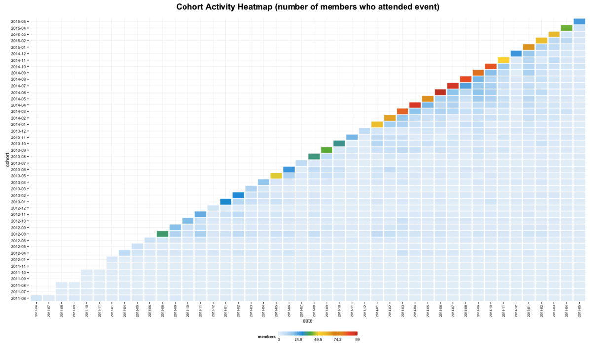
't' is the maximum number of members within a cohort who attended a meetup in a given month. This makes it easy to see which cohorts started with the most members but makes it difficult to compare their retention over time.
We can fix that by showing the percentage of members in the cohort who attend each month rather than using absolute values. To do that we must first add an extra column containing the percentage values:
cohortAttendanceWithMonthNumber$retentionPercentage = ifelse(!is.na(cohortAttendanceWithMonthNumber$retention),  cohortAttendanceWithMonthNumber$retention * 100, 0)
t <- max(cohortAttendanceWithMonthNumber$retentionPercentage)

cols <- c("#e7f0fa", "#c9e2f6", "#95cbee", "#0099dc", "#4ab04a", "#ffd73e", "#eec73a", "#e29421", "#e29421", "#f05336", "#ce472e")
ggplot(cohortAttendanceWithMonthNumber, aes(y=cohort, x=date, fill=retentionPercentage)) +
  theme_minimal() +
  geom_tile(colour="white", linewidth=2, width=.9, height=.9) +
  scale_fill_gradientn(colours=cols, limits=c(0, t),
                       breaks=seq(0, t, by=t/4),
                       labels=c("0", round(t/4*1, 1), round(t/4*2, 1), round(t/4*3, 1), round(t/4*4, 1)),
                       guide=guide_colourbar(ticks=T, nbin=50, barheight=.5, label=T, barwidth=10)) +
  theme(legend.position='bottom',
        legend.direction="horizontal",
        plot.title = element_text(size=20, face="bold", vjust=2),
        axis.text.x=element_text(size=8, angle=90, hjust=.5, vjust=.5, face="plain")) +
  ggtitle("Cohort Activity Heatmap (number of members who attended event)")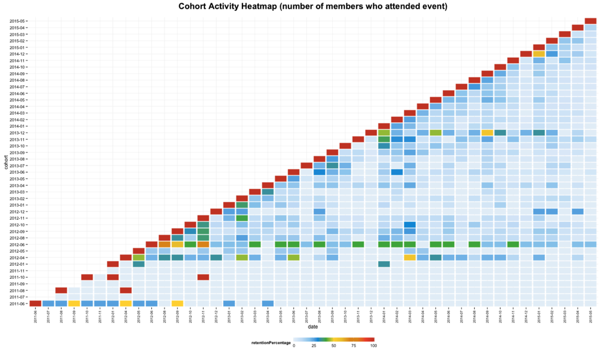
This version allows us to compare cohorts against each other but now we don’t have the exact numbers which means earlier cohorts will look better since there are less people in them. We can get the best of both worlds by keeping this visualisation but showing the actual values inside each box:
t <- max(cohortAttendanceWithMonthNumber$retentionPercentage)

cols <- c("#e7f0fa", "#c9e2f6", "#95cbee", "#0099dc", "#4ab04a", "#ffd73e", "#eec73a", "#e29421", "#e29421", "#f05336", "#ce472e")
ggplot(cohortAttendanceWithMonthNumber, aes(y=cohort, x=date, fill=retentionPercentage)) +
  theme_minimal() +
  geom_tile(colour="white", linewidth=2, width=.9, height=.9) +
  scale_fill_gradientn(colours=cols, limits=c(0, t),
                       breaks=seq(0, t, by=t/4),
                       labels=c("0", round(t/4*1, 1), round(t/4*2, 1), round(t/4*3, 1), round(t/4*4, 1)),
                       guide=guide_colourbar(ticks=T, nbin=50, barheight=.5, label=T, barwidth=10)) +
  theme(legend.position='bottom',
        legend.direction="horizontal",
        plot.title = element_text(size=20, face="bold", vjust=2),
        axis.text.x=element_text(size=8, angle=90, hjust=.5, vjust=.5, face="plain")) +
  ggtitle("Cohort Activity Heatmap (number of members who attended event)") +
  geom_text(aes(label=members),size=3)
What we can learn overall is that the majority of people seem to have a passing interest and then we have a smaller percentage who will continue to come to events.
It seems like we did a better job at retaining attendees in the middle of last year - one hypothesis is that the events we ran around then were more compelling but I need to do more analysis.
Next I’m going to drill further into some of the recent events and see what cohorts the attendees came from.
About the author
I'm currently working on short form content at ClickHouse. I publish short 5 minute videos showing how to solve data problems on YouTube @LearnDataWithMark. I previously worked on graph analytics at Neo4j, where I also co-authored the O'Reilly Graph Algorithms Book with Amy Hodler.