
R: ggplot - Displaying multiple charts with a for loop
Continuing with my analysis of the Neo4j London user group I wanted to drill into some individual meetups and see the makeup of the people attending those meetups with respect to the cohort they belong to.
I started by writing a function which would take in an event ID and output a bar chart showing the number of people who attended that event from each cohort. <?p>
We can work out the cohort that a member belongs to by querying for the first event they attended.
Our query for the most recent Intro to graphs session looks like this: ~r library(RNeo4j) graph = startGraph("http://127.0.0.1:7474/db/data/") eventId = "220750415" query = "match (g:Group {name: 'Neo4j - London User Group'})-[:HOSTED_EVENT]-> (e {id: {id}})<-[:TO]-(rsvp {response: 'yes'})<-[:RSVPD]-(person) WITH rsvp, person MATCH (person)-[:RSVPD]->(otherRSVP) WITH person, rsvp, otherRSVP ORDER BY person.id, otherRSVP.time WITH person, rsvp, COLLECT(otherRSVP)[0] AS earliestRSVP return rsvp.time, earliestRSVP.time, person.id" df = cypher(graph, query, id= eventId) > df %>% sample_n(10) rsvp.time earliestRSVP.time person.id 18 1.430819e+12 1.392726e+12 130976662 95 1.430069e+12 1.430069e+12 10286388 79 1.429035e+12 1.429035e+12 38344282 64 1.428108e+12 1.412935e+12 153473172 73 1.429513e+12 1.398236e+12 143322942 19 1.430389e+12 1.430389e+12 129261842 37 1.429643e+12 1.327603e+12 9750821 49 1.429618e+12 1.429618e+12 184325696 69 1.430781e+12 1.404554e+12 67485912 1 1.430929e+12 1.430146e+12 185405773 ~
We’re not doing anything too clever here, just using a couple of WITH clauses to order RSVPs so we can get the earlier one for each person.
Once we’ve done that we’ll tidy up the data frame so that it contains columns containing the cohort in which the member attended their first event: ~r timestampToDate <- function(x) as.POSIXct(x / 1000, origin="1970-01-01", tz = "GMT") df$time = timestampToDate(df$rsvp.time) df$date = format(as.Date(df$time), "%Y-%m") df$earliestTime = timestampToDate(df$earliestRSVP.time) df$earliestDate = format(as.Date(df$earliestTime), "%Y-%m") > df %>% sample_n(10) rsvp.time earliestRSVP.time person.id time date earliestTime earliestDate 47 1.430697e+12 1.430697e+12 186893861 2015-05-03 23:47:11 2015-05 2015-05-03 23:47:11 2015-05 44 1.430924e+12 1.430924e+12 186998186 2015-05-06 14:49:44 2015-05 2015-05-06 14:49:44 2015-05 85 1.429611e+12 1.422378e+12 53761842 2015-04-21 10:13:46 2015-04 2015-01-27 16:56:02 2015-01 14 1.430125e+12 1.412690e+12 7994846 2015-04-27 09:01:58 2015-04 2014-10-07 13:57:09 2014-10 29 1.430035e+12 1.430035e+12 37719672 2015-04-26 07:59:03 2015-04 2015-04-26 07:59:03 2015-04 12 1.430855e+12 1.430855e+12 186968869 2015-05-05 19:38:10 2015-05 2015-05-05 19:38:10 2015-05 41 1.428917e+12 1.422459e+12 133623562 2015-04-13 09:20:07 2015-04 2015-01-28 15:37:40 2015-01 87 1.430927e+12 1.430927e+12 185155627 2015-05-06 15:46:59 2015-05 2015-05-06 15:46:59 2015-05 62 1.430849e+12 1.430849e+12 186965212 2015-05-05 17:56:23 2015-05 2015-05-05 17:56:23 2015-05 8 1.430237e+12 1.425567e+12 184979500 2015-04-28 15:58:23 2015-04 2015-03-05 14:45:40 2015-03 ~ Now that we’ve got that we can group by the earliestDate cohort and then create a bar chart: ~r byCohort = df %>% count(earliestDate) ggplot(aes(x= earliestDate, y = n), data = byCohort) + geom_bar(stat="identity", fill = "dark blue") + theme(axis.text.x=element_text(angle=90,hjust=1,vjust=1)) ~
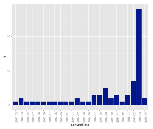
This is good and gives us the insight that most of the members attending this version of intro to graphs just joined the group. The event was on 7th April and most people joined in March which makes sense.
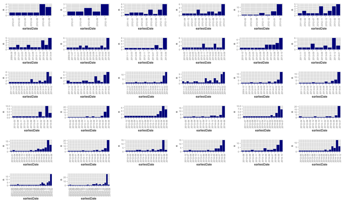
Let’s see if that trend continues over the previous two years. To do this we need to create a for loop which goes over all the Intro to Graphs events and then outputs a chart for each one.
First I pulled out the code above into a function: ~r plotEvent = function(eventId) { query = "match (g:Group {name: 'Neo4j - London User Group'})-[:HOSTED_EVENT]-> (e {id: {id}})<-[:TO]-(rsvp {response: 'yes'})<-[:RSVPD]-(person) WITH rsvp, person MATCH (person)-[:RSVPD]->(otherRSVP) WITH person, rsvp, otherRSVP ORDER BY person.id, otherRSVP.time WITH person, rsvp, COLLECT(otherRSVP)[0] AS earliestRSVP return rsvp.time, earliestRSVP.time, person.id" df = cypher(graph, query, id= eventId) df$time = timestampToDate(df$rsvp.time) df$date = format(as.Date(df$time), "%Y-%m") df$earliestTime = timestampToDate(df$earliestRSVP.time) df$earliestDate = format(as.Date(df$earliestTime), "%Y-%m") byCohort = df %>% count(earliestDate) ggplot(aes(x= earliestDate, y = n), data = byCohort) + geom_bar(stat="identity", fill = "dark blue") + theme(axis.text.x=element_text(angle=90,hjust=1,vjust=1)) } ~
We’d call it like this for the Intro to graphs meetup: ~r > plotEvent("220750415") ~
Next I tweaked the code to look up all Into to graphs events and then loop through and output a chart for each event: ~r events = cypher(graph, "match (e:Event {name: 'Intro to Graphs'}) RETURN e.id ORDER BY e.time") for(event in events$n) { plotEvent(as.character(event)) } ~
Unfortunately that doesn’t print anything at all which we can fix by storing our plots in a list and then displaying it afterwards: ~R library(gridExtra) p = list() for(i in 1:count(events)$n) { event = events[i, 1] p = plotEvent(as.character(event)) } do.call(grid.arrange,p) ~
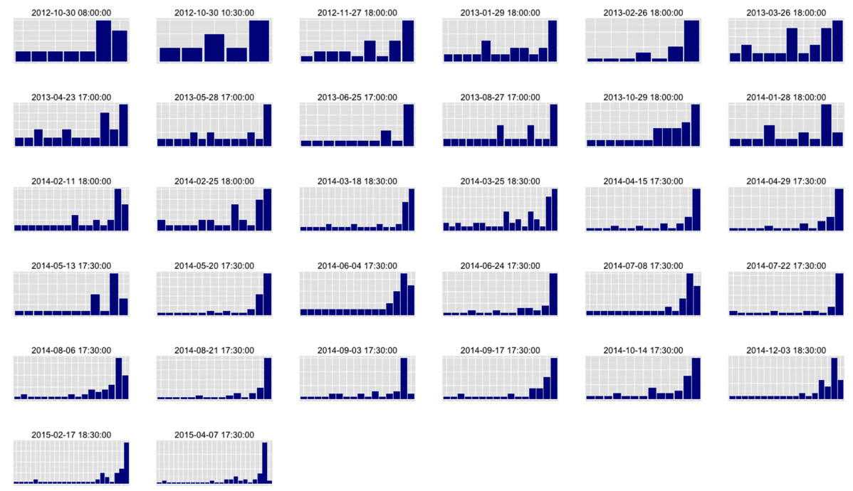
This visualisation is probably better without any of the axis so let’s update the function to scrap those. We’ll also add the date of the event at the top of each chart which will require a slight tweak of the query: ~R plotEvent = function(eventId) { query = "match (g:Group {name: 'Neo4j - London User Group'})-[:HOSTED_EVENT]-> (e {id: {id}})<-[:TO]-(rsvp {response: 'yes'})<-[:RSVPD]-(person) WITH e,rsvp, person MATCH (person)-[:RSVPD]->(otherRSVP) WITH e,person, rsvp, otherRSVP ORDER BY person.id, otherRSVP.time WITH e, person, rsvp, COLLECT(otherRSVP)[0] AS earliestRSVP return rsvp.time, earliestRSVP.time, person.id, e.time" df = cypher(graph, query, id= eventId) df$time = timestampToDate(df$rsvp.time) df$eventTime = timestampToDate(df$e.time) df$date = format(as.Date(df$time), "%Y-%m") df$earliestTime = timestampToDate(df$earliestRSVP.time) df$earliestDate = format(as.Date(df$earliestTime), "%Y-%m") byCohort = df %>% count(earliestDate) ggplot(aes(x= earliestDate, y = n), data = byCohort) + geom_bar(stat="identity", fill = "dark blue") + theme(axis.ticks = element_blank(), axis.text.x = element_blank(), axis.text.y = element_blank(), axis.title.x = element_blank(), axis.title.y = element_blank()) + labs(title = df$eventTime[1]) } ~
I think this makes it a bit easier to read although I’ve made the mistake of not having all the charts representing the same scale - one to fix for next time.
We started doing the intro to graphs sessions less frequently towards the end of last year so my hypothesis was that we’d see a range of people from different cohorts RSVPing for them but that doesn’t seem to be the case. Instead it’s very dominated by people signing up close to the event.
About the author
I'm currently working on short form content at ClickHouse. I publish short 5 minute videos showing how to solve data problems on YouTube @LearnDataWithMark. I previously worked on graph analytics at Neo4j, where I also co-authored the O'Reilly Graph Algorithms Book with Amy Hodler.