
R: ggplot geom_density - Error in exists(name, envir = env, mode = mode) : argument "env" is missing, with no default
Continuing on from yesterday’s blog post where I worked out how to clean up the Think Bayes Price is Right data set, the next task was to plot a distribution of the prices of show case items.
To recap, this is what the data frame we’re working with looks like:
library(dplyr)

df2011 = read.csv("~/projects/rLearning/showcases.2011.csv", na.strings = c("", "NA"))
df2011 = df2011 %>% na.omit()

> df2011 %>% head()
              X Sep..19 Sep..20 Sep..21 Sep..22 Sep..23 Sep..26 Sep..27 Sep..28 Sep..29 Sep..30 Oct..3
3    Showcase 1   50969   21901   32815   44432   24273   30554   20963   28941   25851   28800  37703
4    Showcase 2   45429   34061   53186   31428   22320   24337   41373   45437   41125   36319  38752
6         Bid 1   42000   14000   32000   27000   18750   27222   25000   35000   22500   21300  21567
7         Bid 2   34000   59900   45000   38000   23000   18525   32000   45000   32000   27500  23800
9  Difference 1    8969    7901     815   17432    5523    3332   -4037   -6059    3351    7500  16136
10 Difference 2   11429  -25839    8186   -6572    -680    5812    9373     437    9125    8819  14952
...
So our goal is to plot the density of the 'Showcase 1' items. Unfortunately those aren’t currently stored in a way that makes this easy for us. We need to flip the data frame so that we have a row for each date/price type/price:
PriceType  Date     Price
Showcase 1 Sep..19  50969
Showcase 2 Sep..19  21901
...
Showcase 1 Sep..20  45429
Showcase 2 Sep..20  34061
The reshape library’s melt function is our friend here:
library(reshape)
meltedDf = melt(df2011, id=c("X"))

> meltedDf %>% sample_n(10)
                X variable value
643    Showcase 1  Feb..24 27883
224    Showcase 2  Nov..10 34089
1062 Difference 2   Jun..4  9962
770    Showcase 2  Mar..28 39620
150  Difference 2  Oct..24  9137
431  Difference 1   Jan..4  7516
345         Bid 1  Dec..12 21569
918  Difference 2    May.1 -2093
536    Showcase 2  Jan..31 30918
502         Bid 2  Jan..23 27000
Now we need to plug this into ggplot. We’ll start by just plotting all the prices for showcase 1:
> ggplot(aes(x = value), data = meltedDf %>% filter(X == "Showcase 1")) +
    geom_density()

Error in exists(name, envir = env, mode = mode) :
  argument "env" is missing, with no default
This error usually means that you’ve passed an empty data set to ggplot which isn’t the case here, but if we extract the values column we can see the problem:
> meltedDf$value[1:10]
 [1] "50969" "45429" "42000" "34000" "8969"  "11429" "21901" "34061" "14000" "59900"
They are all strings! Making it very difficult to plot a density curve which relies on the data being continuous. Let’s fix that and try again:
meltedDf$value = as.numeric(meltedDf$value)

ggplot(aes(x = value), data = meltedDf %>% filter(X == "Showcase 1")) +
  geom_density()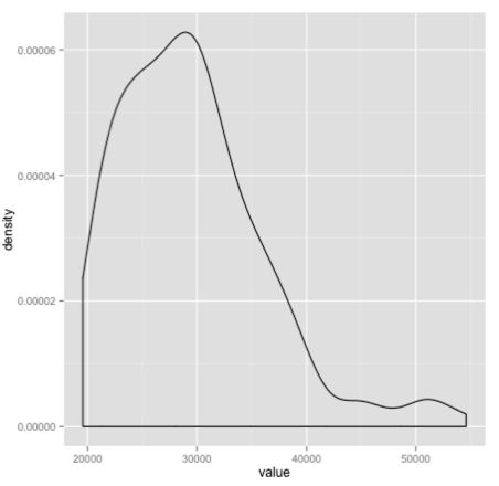
If we want to show the curves for both showcases we can tweak our code slightly:
ggplot(meltedDf %>% filter(grepl("Showcase", X)), aes(x = value, colour = X)) +
  geom_density() +
  theme(legend.position="top")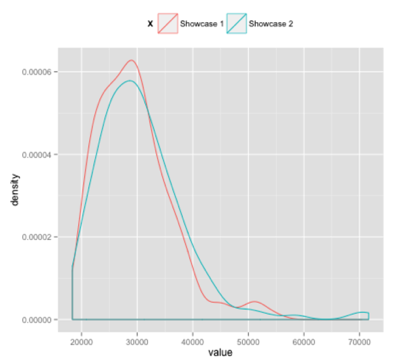
Et voila!
About the author
I'm currently working on short form content at ClickHouse. I publish short 5 minute videos showing how to solve data problems on YouTube @LearnDataWithMark. I previously worked on graph analytics at Neo4j, where I also co-authored the O'Reilly Graph Algorithms Book with Amy Hodler.