
R: ggplot - Show discrete scale even with no value
As I mentioned in a previous blog post, I’ve been scraping data for the Wimbledon tennis tournament, and having got the data for the last ten years I wrote a query using dplyr to find out how players did each year over that period.
I ended up with the following functions to filter my data frame of all the matches:
round_reached = function(player, main_matches) {
  furthest_match = main_matches %>%
    filter(winner == player | loser == player) %>%
    arrange(desc(round)) %>%
    head(1)

    return(ifelse(furthest_match$winner == player, "Winner", as.character(furthest_match$round)))
}

player_performance = function(name, matches) {
  player = data.frame()
  for(y in 2005:2014) {
    round = round_reached(name, filter(matches, year == y))
    if(length(round) == 1) {
      player = rbind(player, data.frame(year = y, round = round))
    } else {
      player = rbind(player, data.frame(year = y, round = "Did not enter"))
    }
  }
  return(player)
}
When we call that function we see the following output:
> player_performance("Andy Murray", main_matches)
   year          round
1  2005    Round of 32
2  2006    Round of 16
3  2007  Did not enter
4  2008 Quarter-Finals
5  2009    Semi-Finals
6  2010    Semi-Finals
7  2011    Semi-Finals
8  2012         Finals
9  2013         Winner
10 2014 Quarter-Finals
I wanted to create a chart showing Murray’s progress over the years with the round reached on the y axis and the year on the x axis. In order to do this I had to make sure the 'round' column was being treated as a factor variable:
df = player_performance("Andy Murray", main_matches)

rounds = c("Did not enter", "Round of 128", "Round of 64", "Round of 32", "Round of 16", "Quarter-Finals", "Semi-Finals", "Finals", "Winner")
df$round = factor(df$round, levels =  rounds)

> df$round
 [1] Round of 32    Round of 16    Did not enter  Quarter-Finals Semi-Finals    Semi-Finals    Semi-Finals
 [8] Finals         Winner         Quarter-Finals
Levels: Did not enter Round of 128 Round of 64 Round of 32 Round of 16 Quarter-Finals Semi-Finals Finals Winner
Now that we’ve got that we can plot his progress:
ggplot(aes(x = year, y = round, group=1), data = df) +
    geom_point() +
    geom_line() +
    scale_x_continuous(breaks=df$year) +
    scale_y_discrete(breaks = rounds)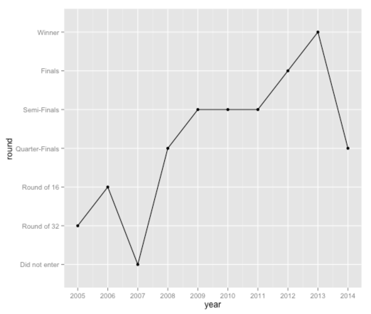
This is a good start but we’ve lost the rounds which don’t have a corresponding entry on the x axis. I’d like to keep them so it’s easier to compare the performance of different players.
It turns out that all we need to do is pass 'drop = FALSE' to scale_y_discrete and it will work exactly as we want:
ggplot(aes(x = year, y = round, group=1), data = df) +
    geom_point() +
    geom_line() +
    scale_x_continuous(breaks=df$year) +
    scale_y_discrete(breaks = rounds, drop = FALSE)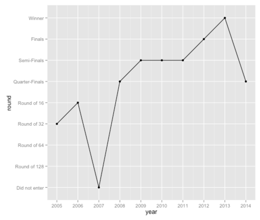
Neat. Now let’s have a look at the performances of some of the other top players:
draw_chart = function(player, main_matches){
  df = player_performance(player, main_matches)
  df$round = factor(df$round, levels =  rounds)

  ggplot(aes(x = year, y = round, group=1), data = df) +
    geom_point() +
    geom_line() +
    scale_x_continuous(breaks=df$year) +
    scale_y_discrete(breaks = rounds, drop=FALSE) +
    ggtitle(player) +
    theme(axis.text.x=element_text(angle=90, hjust=1))
}

a = draw_chart("Andy Murray", main_matches)
b = draw_chart("Novak Djokovic", main_matches)
c = draw_chart("Rafael Nadal", main_matches)
d = draw_chart("Roger Federer", main_matches)

library(gridExtra)
grid.arrange(a,b,c,d, ncol=2)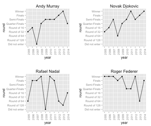
And that’s all for now!
About the author
I'm currently working on short form content at ClickHouse. I publish short 5 minute videos showing how to solve data problems on YouTube @LearnDataWithMark. I previously worked on graph analytics at Neo4j, where I also co-authored the O'Reilly Graph Algorithms Book with Amy Hodler.