
Graphing Brexit: Plotting how the parties voted
Over the last week I’ve revisited the Brexit Graph that I created in March 2019, this time looking at how the parties voted on average on each of the indicative votes.
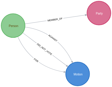
To recap, we have a graph that has the following schema:
Since the initial post I’ve slightly changed how the MEMBER_OF relationship works.
As several MPs have switched MPs in the intervening months, we’re now storing a start property to indicate when they started representing a party and an end property to indicate when they stopped representing a party.
This change to the model means that we need to do some filtering to work out which party they were representing when a vote took place.
We want to work out how the parties voted on average across each of the different Brexit indicative votes. We want to come up with a score for each party for each vote, which we’ll do by aggregating scores by party using the following scoring system for each MP’s position on a particular motion:
-
Voted For = 1.0
-
Did Not Vote = 0.5
-
Voted Against = 0
Let’s run through a couple of examples:
-
If everybody in a party voted
Fora motion, that party would have a score of 1.0 for that motion. -
If everybody in a party voted
Againsta motion, that party would have a score of 0.0 for that motion. -
If a party has 5 MPs, with 3 voting
Forand 2Did Not Vote, they’d have a score of(3*1.0 + 2*0.5)/5 = 4/5 = 0.8
We can compute the average vote by a party for a motion by writing the following query:
MATCH (m:Motion)<-[vote]-(person:Person)
MATCH (person)-[memberOf:MEMBER_OF]->(party)
WHERE memberOf.start <= m.date AND (not(exists(memberOf.end)) OR m.date <= memberOf.end)
WITH m, party, CASE WHEN type(vote) = "FOR" THEN 1
                    WHEN type(vote) = "DID_NOT_VOTE" THEN 0.5
                    ELSE 0 END AS score
RETURN m.division, m.name, party.name, avg(score) AS score, count(*) AS count
ORDER BY m.name, party.name
LIMIT 10| m.division | m.name | party.name | score | count |
|---|---|---|---|---|
"388" |
"George Eustice’s motion H (EFTA and EEA)" |
"Conservative" |
0.2731629392971245 |
313 |
"388" |
"George Eustice’s motion H (EFTA and EEA)" |
"DUP" |
0.5 |
10 |
"388" |
"George Eustice’s motion H (EFTA and EEA)" |
"Green" |
0.0 |
1 |
"388" |
"George Eustice’s motion H (EFTA and EEA)" |
"Independent" |
0.15 |
20 |
"388" |
"George Eustice’s motion H (EFTA and EEA)" |
"Labour" |
0.25352112676056326 |
213 |
"388" |
"George Eustice’s motion H (EFTA and EEA)" |
"Labour/Co-operative" |
0.265625 |
32 |
"388" |
"George Eustice’s motion H (EFTA and EEA)" |
"Liberal Democrat" |
0.4090909090909091 |
11 |
"388" |
"George Eustice’s motion H (EFTA and EEA)" |
"Plaid Cymru" |
0.5 |
4 |
"388" |
"George Eustice’s motion H (EFTA and EEA)" |
"Scottish National Party" |
0.014285714285714292 |
35 |
"388" |
"George Eustice’s motion H (EFTA and EEA)" |
"Sinn Féin" |
0.5 |
7 |
None of the parties much liked this motion. The best average score it received was by the DUP, Plaid Cymru, and Sinn Fein, whose members on average didn’t vote. For the other parties the average score indicates that at least some of their members were against it.
We’ll store this information in our graph, by creating a relationship between the party and the motion, storing the average rating as a property on the relationship:
MATCH (m:Motion)<-[vote]-(person:Person)
MATCH (person)-[memberOf:MEMBER_OF]->(party)
WHERE memberOf.start <= m.date AND (not(exists(memberOf.end)) OR m.date <= memberOf.end)
WITH m, party, CASE WHEN type(vote) = "FOR" THEN 1
                    WHEN type(vote) = "DID_NOT_VOTE" THEN 0.5
                    ELSE 0 END AS score
WITH m, party, avg(score) AS score
MERGE (party)-[averageVote:AVERAGE_VOTE]->(m)
SET averageVote.score = score;
The image below shows the relationships that have been created:

Now that we’ve stored the average votes, we can write a bit of Python code to create bar charts showing the average votes across all the motions. The following code does this:
import matplotlib.pyplot as plt
import numpy as np
from neo4j import GraphDatabase

driver = GraphDatabase.driver("bolt://localhost")

fig = plt.figure()
fig.set_size_inches(16.5, 14.5)
fig.subplots_adjust(hspace=0.4, wspace=0.4)

with driver.session() as session:
    for index, division in enumerate(["386", "387", "388", "389", "390", "391", "392", "393"]):
        rows = session.run("""
        MATCH (m:Motion {division: $division})
        RETURN m.name AS motion
        """, {"division": division})
        motion = rows.peek()["motion"]

        rows = session.run("""
        MATCH (p:Party)-[vote:AVERAGE_VOTE]->(m:Motion {division: $division})
        RETURN p.name AS party, vote.score AS score, m.name AS motion
        ORDER BY party
        """, {"division": division})

        result = [{"party": row["party"], "score": row["score"]} for row in rows ]

        plt.rcdefaults()
        ax = fig.add_subplot(4, 2, index+1)

        parties = [item["party"] for item in result]
        y_pos = np.arange(len(parties))
        scores = [item["score"] for item in result]

        ax.barh(y_pos, scores, align='center')
        ax.set_yticks(y_pos)
        ax.set_yticklabels(parties)
        ax.invert_yaxis()

        ax.set_title(motion)

        ax.set_xlim([0,1])
        plt.xticks([0, 0.5, 1], ["Against", "Did Not Vote", "For"])

plt.tight_layout()
plt.savefig("images/votes.svg")
plt.close()
If we execute this script, we’ll see the following charts:

From this diagram we can clearly see that the only indicative vote that Conservative Party members in general voted in favour of was the Mr Baron’s Motion B (no deal). I guess this chart actually foresaw the current composition of the cabinet.
All the parties except for the DUP, Sinn Fein, and the Conservatives on average were in favour of Joanna Cherry’s motion L (Revocation to avoid no deal) and Margaret Beckett’s motion M (Confirmatory public vote).
Only Labour MPs voted on average in favour of Jeremy Corbyn’s motion K (Labour’s alternative plan) and Mr Clarke’s motion J (Customs union).
Now that we’ve computed the average vote of each party we can see whether there are people whose average votes correlate more closely with another party than their own. We’ll have a look at that in our next post in the Graphing Brexit series.
About the author
I'm currently working on short form content at ClickHouse. I publish short 5 minute videos showing how to solve data problems on YouTube @LearnDataWithMark. I previously worked on graph analytics at Neo4j, where I also co-authored the O'Reilly Graph Algorithms Book with Amy Hodler.