
Creating an Interactive UK Official Charts Data App with Streamlit and Neo4j
I recently came across Streamlit, a tool that makes it easy to build data based single page web applications. I wanted to give it a try, and the UK Charts QuickGraph that I recently wrote about seemed like a good opportunity for that.
This blog post starts from where we left off. The data is loaded into Neo4j and we’ve written some queries to explore different aspects of the dataset. Let’s see what we can do if we integrate Neo4j and Streamlit.

Setting up our environment
The first thing we need to do is setup our environment. Streamlit is a Python library, so we’ll be using it alongside the Neo4j Python driver, as well as some other dependencies.
I like to use Pipenv for my Python projects. Our Pipfile is defined below:
[[source]]
name = "pypi"
url = "https://pypi.org/simple"
verify_ssl = true

[dev-packages]

[packages]
streamlit = "*"
neo4j = "*"
vega-datasets = "*"
selenium = "*"
vegascope = "*"

[requires]
python_version = "3.7"
If we create that file in a directory, we can install all our dependencies by running the following command:
pipenv installIf we run that command, we’ll see the following output:
Pipfile.lock not found, creating…
Locking [dev-packages] dependencies…
Locking [packages] dependencies…
✔ Success!
Updated Pipfile.lock (0882a9)!
Installing dependencies from Pipfile.lock (0882a9)…
  🐍   ▉▉▉▉▉▉▉▉▉▉▉▉▉▉▉▉▉▉▉▉▉▉▉▉▉▉▉▉▉▉▉▉ 84/84 — 00:00:11
To activate this project's virtualenv, run pipenv shell.
Alternatively, run a command inside the virtualenv with pipenv run.
We’ll follow those instructions, and now we’re ready to build our Streamlit application.
Streamlit Application
We’re going to create our Streamlit application in a file called visualise.py.
Let’s import the libraries that we’re going to be using:
import streamlit as st
from neo4j import GraphDatabase
import pandas as pd
import altair as alt
import datetime
from PIL import Image
We’ll also instantiate our Neo4j Driver and give our Streamlit application a title and an image to make it look a bit prettier:
driver = GraphDatabase.driver("bolt://localhost", auth=("neo4j", "neo"))
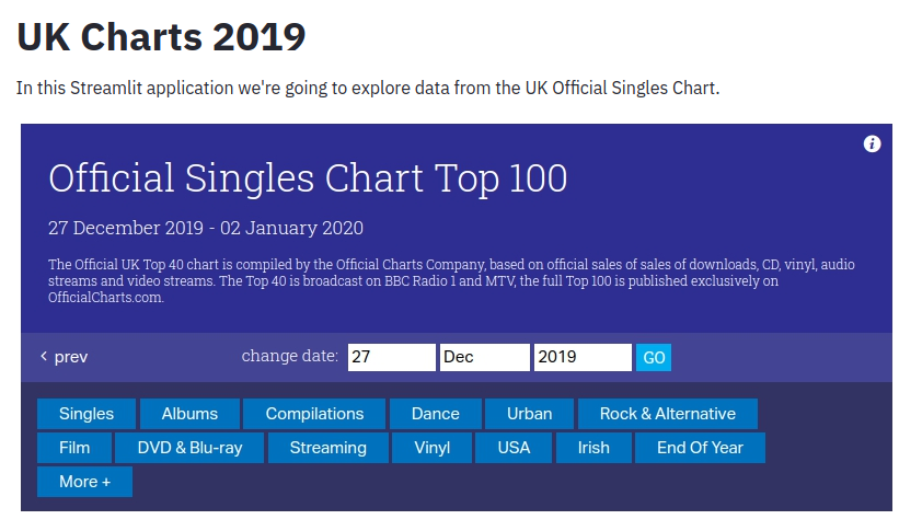
st.title("UK Charts 2019")
st.write("In this Streamlit application we're going to explore data from the UK Official Singles Chart.")
st.image(Image.open("images/uk-charts.png"))We can now launch our application by running the following command from the terminal:
streamlit run visualise.pyWhen we run this command, we’ll see the following output:
You can now view your Streamlit app in your browser.

Local URL: http://localhost:8501
Network URL: http://192.168.86.25:8501
If we navigate to the Local URL, we’ll see a page that looks like this:
So far so good! Let’s add some more content to the page based on the queries that we ran in the QuickGraph blog post.
Which song was number 1 for the most weeks?
The first thing we did in our previous post was work out which song was number 1 for the most weeks. We’ll start by returning all the numbers 1 songs in 2019. The following code sample uses the Neo4j Python driver to execute a Cypher query that finds all the number 1 songs, puts them in a DataFrame, and then displays that DataFrame:
with driver.session() as session:
    st.subheader("Number 1s")
    st.write("The chart below shows the number 1 charting songs of 2019.")
    result = session.run("""
    MATCH (chart:Chart)<-[inChart:IN_CHART {position: 1}]-(song)-[:ARTIST]->(artist)
    WITH chart, song, collect(artist.name) AS artists
    RETURN toString(chart.end) AS date, song.title AS song, artists
    ORDER BY chart.end
    """)
    df = pd.DataFrame(result.data())
    st.dataframe(df.style.hide_index())
If we refresh the page in our web browser, we’ll see the following output:
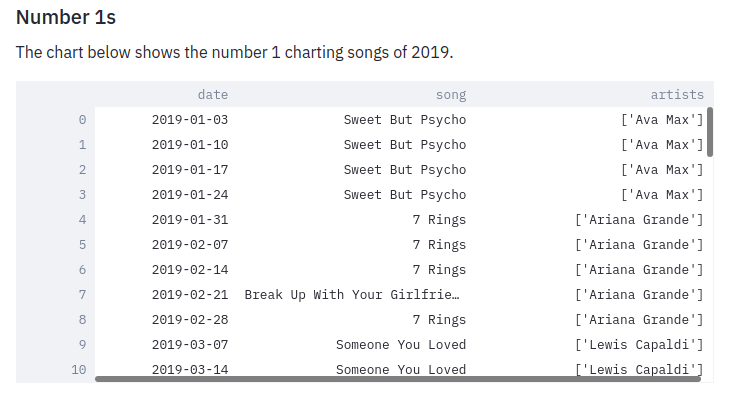
We want to know which song was number 1 for the most weeks, and a bar chart seems like a good way of displaying this data. Let’s create one:
    result = session.run("""
    MATCH (song:Song)-[inChart:IN_CHART {position: 1}]->(chart)
    RETURN song.title AS song, count(*) AS count
    ORDER By count DESC;
    """)

    df = pd.DataFrame(result.data())

    c = alt.Chart(df, width=500, height=400).mark_bar(clip=True).encode(x='song', y='count')
    st.altair_chart(c)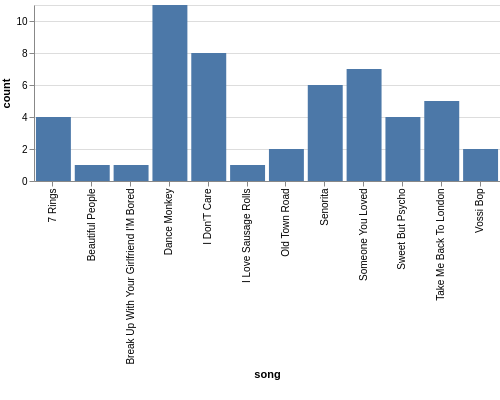
Which song was number 1 on a specific date?
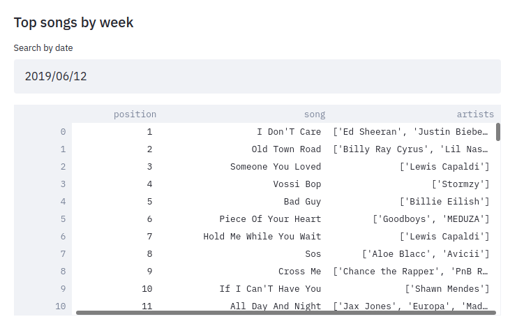
As well as returning the results of a hard coded query like this, we can also execute dynamic queries based on user input.
The date_input component gives us a calendar from which the user can select a date that we use in a query.
The code below runs a query that returns the chart for a given date:
    st.subheader("Top songs by week")
    date = st.date_input("Search by date", datetime.date(2019, 12, 12))

    result = session.run("""
    MATCH (chart:Chart)<-[inChart:IN_CHART]-(song)
    WHERE chart.start <= $date <= chart.end
    RETURN inChart.position AS position, song.title AS song, [(song)-[:ARTIST]->(artist) | artist.name] AS artists
    ORDER BY position
    """, {"date": date})
    df = pd.DataFrame(result.data())
    st.dataframe(df.style.hide_index())
Let’s have a look which songs were at the top of the chart in June 2019:
How did a song chart over the year?
In the QuickGraph blog post we wrote a query to find out which number 1 songs didn’t go straight in at number 1. One of my favourite songs, Dance Monkey, took 8 weeks from its first appearance in the chart until it got to the top.
We can use Streamlit to create a DataFrame and scatterplot showing how a song charted over the year:
    st.subheader("Songs charting over time")
    name = st.text_input('Search by song title', 'All I Want For Christmas')
    if name:
            result = session.run("""
            MATCH (chart:Chart)<-[inChart:IN_CHART]-(song)-[:ARTIST]->(artist)
            WHERE song.title contains $songTitle
            WITH song, inChart, chart, collect(artist.name) AS artists
            RETURN song.title AS song, artists, inChart.position AS position, chart.end AS date
            ORDER BY chart.end
            """, {"songTitle": name})

            df = pd.DataFrame(result.data())
            st.dataframe(df.style.hide_index())

            if df.shape[0] > 0:
                c = alt.Chart(df, title=f"Chart positions for {name}", width=500, height=300).mark_point().encode(
                    x=alt.X('date:T', timeUnit='yearmonthdate', scale=alt.Scale(domain=list(domain_pd))),
                    y=alt.Y('position', sort="descending")
                )
                st.altair_chart(c)
And let’s see how Dance Monkey fared:
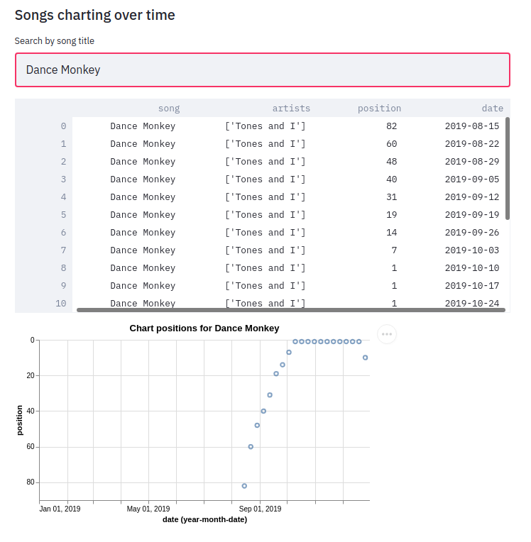
We can see from this chart that the song had a very gradual climb to the top. I’d always assumed that songs achieved their top position when they were first released, but this is an interesting counter example.
That’s all for this blog post, but I’m looking forward to combining Streamlit and Neo4j on future datasets.
About the author
I'm currently working on short form content at ClickHouse. I publish short 5 minute videos showing how to solve data problems on YouTube @LearnDataWithMark. I previously worked on graph analytics at Neo4j, where I also co-authored the O'Reilly Graph Algorithms Book with Amy Hodler.