
Plotly: Visualising a normal distribution given average and standard deviation
I’ve been playing around with Microsoft’s TrueSkill algorithm, which attempts to quantify the skill of a player using the Bayesian inference algorithm. A rating in this system is a Gaussian distribution that starts with an average of 25 and a confidence of 8.333. I wanted to visualise various ratings using Plotly and that’s what we’ll be doing in this blog post.
To save you from having to install TrueSkill, we’re going to create a named tuple to simulate a TrueSkill Rating object:
from collections import namedtuple
Rating = namedtuple('Rating', ['mu', 'sigma'])

base = Rating(25, 25/3)
If we print that object, we’ll see the following output:
Rating(mu=25, sigma=8.333333333333334)To create a visualisation of this distribution, we’ll need to install the following libraries:
pip install plotly numpy scipy kaleido==0.2.1Next, import the following libraries:
import numpy as np
from scipy.stats import norm
import plotly.graph_objects as go
Next, we’re going to create some values for the x-axis.
We’ll use numpy’s arange function to create a series of values starting from -4 standard deviations to +4 standard deviations:
x = np.arange(base.mu-4*base.sigma, base.mu+4*base.sigma, 0.001)array([-8.33333333, -8.33233333, -8.33133333, ..., 58.33066667,
58.33166667, 58.33266667])Next, we’re going to run scipy’s probability density function over the x values for our mu and sigma values. In other words, we’re going to compute the likelihood of each of those x values for our normal distribution:
y = norm.pdf(x, base.mu, base.sigma)array([1.60596271e-05, 1.60673374e-05, 1.60750513e-05, ...,
1.60801958e-05, 1.60724796e-05, 1.60647669e-05]Now that we’ve got x and y values, we can create a visualisation by running the following code:
fig = go.Figure()
fig.add_trace(go.Scatter(x=x, y=y, mode='lines', fill='tozeroy', line_color='black'))
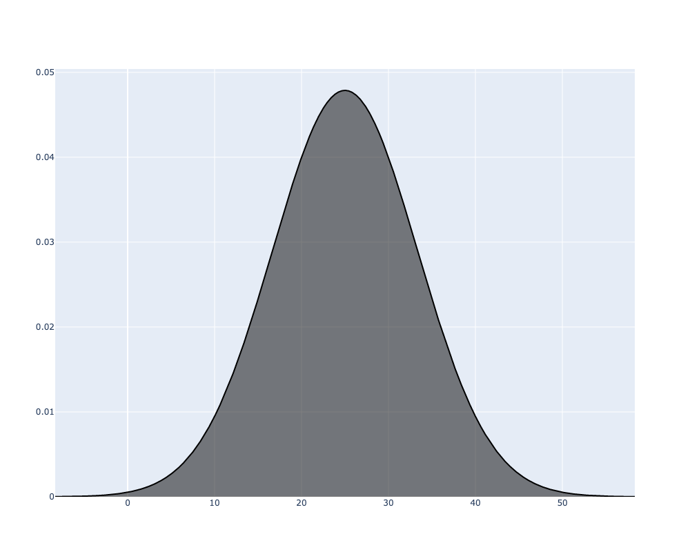
fig.write_image("fig1.png", width=1000, height=800)If we run that code, the following image will be generated:
We can then wrap that all together into a function that can take in multiple ratings:
def visualise_distribution(**kwargs):
  fig = go.Figure()
  min_x = min([r.mu-4*r.sigma for r in kwargs.values()])
  max_x = max([r.mu+4*r.sigma for r in kwargs.values()])
  x = np.arange(min_x, max_x, 0.001)
  for key, value in kwargs.items():
      y = norm.pdf(x, value.mu, value.sigma)
      fig.add_trace(go.Scatter(x=x, y=y, mode='lines', fill='tozeroy', name=key))
  fig.write_image(f"fig_{'_'.join(kwargs.keys())}.png", width=1000, height=800)
Let’s give it a try with 3 different ratings:
visualise_distribution(p1=Rating(25, 8.333), p2=Rating(50, 4.12), p3=Rating(10, 5.7))We can see the resulting image below:
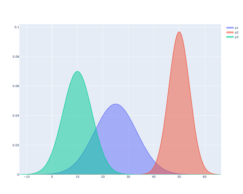
We can see that the curve for p2 is much narrower than the other two, which is because we used a small sigma value.
p1 is the default score and as a result we have the most uncertainty in that rating.
p3 hasn’t performed well and there’s reasonably certainty around their low score.
About the author
I'm currently working on short form content at ClickHouse. I publish short 5 minute videos showing how to solve data problems on YouTube @LearnDataWithMark. I previously worked on graph analytics at Neo4j, where I also co-authored the O'Reilly Graph Algorithms Book with Amy Hodler.