
R: ggplot - Plotting back to back bar charts
I’ve been playing around with R’s ggplot library to explore the Neo4j London meetup and the next thing I wanted to do was plot back to back bar charts showing 'yes' and 'no' RSVPs.
I’d already done the 'yes' bar chart using the following code:
query = "MATCH (e:Event)<-[:TO]-(response {response: 'yes'})
         RETURN response.time AS time, e.time + e.utc_offset AS eventTime"
allYesRSVPs = cypher(graph, query)
allYesRSVPs$time = timestampToDate(allYesRSVPs$time)
allYesRSVPs$eventTime = timestampToDate(allYesRSVPs$eventTime)
allYesRSVPs$difference = as.numeric(allYesRSVPs$eventTime - allYesRSVPs$time, units="days")

ggplot(allYesRSVPs, aes(x=difference)) + geom_histogram(binwidth=1, fill="green")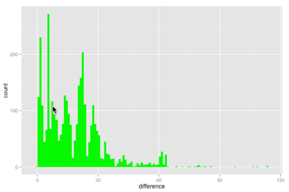
The next step was to create a similar thing for people who’d RSVP’d 'no' having originally RSVP’d 'yes' i.e. people who dropped out:
query = "MATCH (e:Event)<-[:TO]-(response {response: 'no'})<-[:NEXT]-()
         RETURN response.time AS time, e.time + e.utc_offset AS eventTime"
allNoRSVPs = cypher(graph, query)
allNoRSVPs$time = timestampToDate(allNoRSVPs$time)
allNoRSVPs$eventTime = timestampToDate(allNoRSVPs$eventTime)
allNoRSVPs$difference = as.numeric(allNoRSVPs$eventTime - allNoRSVPs$time, units="days")

ggplot(allNoRSVPs, aes(x=difference)) + geom_histogram(binwidth=1, fill="red")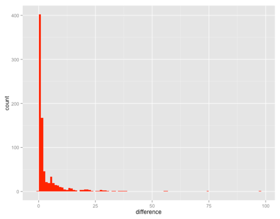
As expected if people are going to drop out they do so a day or two before the event happens. By including the need for a 'NEXT' relationship we only capture the people who replied 'yes' and changed it to 'no'. We don’t capture the people who said 'no' straight away.
I thought it’d be cool to be able to have the two charts back to back using the same scale so I could compare them against each other which led to my first attempt:
yes = ggplot(allYesRSVPs, aes(x=difference)) + geom_histogram(binwidth=1, fill="green")
no = ggplot(allNoRSVPs, aes(x=difference)) + geom_histogram(binwidth=1, fill="red") + scale_y_reverse()
library(gridExtra)
grid.arrange(yes,no,ncol=1,widths=c(1,1))
http://ggplot.yhathq.com/docs/scale_y_reverse.html flips the y axis so we’d see the 'no' chart upside down. The last line plots the two charts in a grid containing 1 column which forces them to go next to each other vertically.
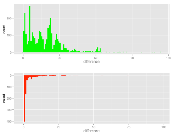
When we compare them next to each other we can see that the 'yes' replies are much more spread out whereas if people are going to drop out it nearly always happens a week or so before the event happens. This is what we thought was happening but it’s cool to have it confirmed by the data.
One annoying thing about that visualisation is that the two charts aren’t on the same scale. The 'no' chart only goes up to 100 days whereas the 'yes' one goes up to 120 days. In addition, the top end of the 'yes' chart is around 200 whereas the 'no' is around 400.
Luckily we can solve that problem by fixing the axes for both plots:
yes = ggplot(allYesRSVPs, aes(x=difference)) +
  geom_histogram(binwidth=1, fill="green") +
  xlim(0,120) +
  ylim(0, 400)

no = ggplot(allNoRSVPs, aes(x=difference)) +
  geom_histogram(binwidth=1, fill="red") +
  xlim(0,120) +
  ylim(0, 400) +
  scale_y_reverse()
Now if we re-render it looks much better:
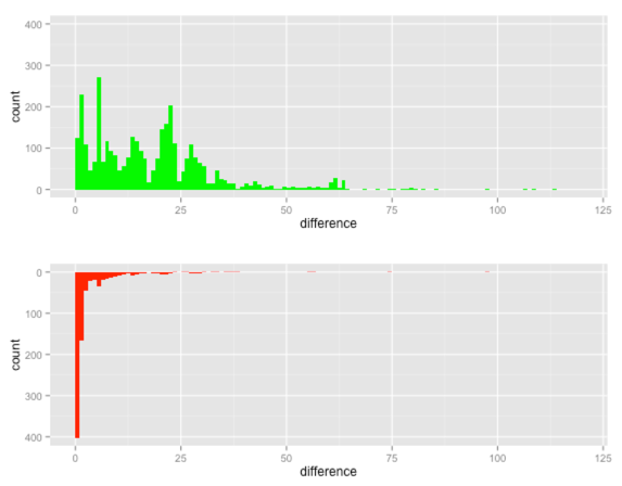
From having comparable axes we can see that a lot more people drop out of an event (500) as it approaches than new people sign up (300). This is quite helpful for working out how many people are likely to show up.
We’ve found that the number of people RSVP’d 'yes' to an event will drop by 15-20% overall from 2 days before an event up until the evening of the event and the data seems to confirm this.
The only annoying thing about this approach is that the axes are repeated due to them being completely separate charts.
I expect it would look better if I can work out how to combine the two data frames together and then pull out back to back charts based on a variable in the combined data frame.
I’m still working on that so suggestions are most welcome. The code is on github if you want to play with it.
About the author
I'm currently working on short form content at ClickHouse. I publish short 5 minute videos showing how to solve data problems on YouTube @LearnDataWithMark. I previously worked on graph analytics at Neo4j, where I also co-authored the O'Reilly Graph Algorithms Book with Amy Hodler.