
R: ggplot - Plotting back to back charts using facet_wrap
Earlier in the week I showed a way to plot back to back charts using R’s ggplot library but looking back on the code it felt like it was a bit hacky to 'glue' two charts together using a grid.
I wanted to find a better way.
To recap, I came up with the following charts showing the RSVPs to Neo4j London meetup events using this code:
The first thing we need to do to simplify chart generation is to return 'yes' and 'no' responses in the same cypher query, like so:
timestampToDate <- function(x) as.POSIXct(x / 1000, origin="1970-01-01", tz = "GMT")

query = "MATCH (e:Event)<-[:TO]-(response {response: 'yes'})
         WITH e, COLLECT(response) AS yeses
         MATCH (e)<-[:TO]-(response {response: 'no'})<-[:NEXT]-()
         WITH e, COLLECT(response) + yeses AS responses
         UNWIND responses AS response
         RETURN response.time AS time, e.time + e.utc_offset AS eventTime, response.response AS response"
allRSVPs = cypher(graph, query)
allRSVPs$time = timestampToDate(allRSVPs$time)
allRSVPs$eventTime = timestampToDate(allRSVPs$eventTime)
allRSVPs$difference = as.numeric(allRSVPs$eventTime - allRSVPs$time, units="days")
The query is a bit verbose because we want to capture the 'no' responses when they initially said yes which is why we check for a 'NEXT' relationship when looking for the negative responses.
Let’s inspect allRSVPs:
> allRSVPs[1:10,]
                  time           eventTime response difference
1  2014-06-13 21:49:20 2014-07-22 18:30:00       no   38.86157
2  2014-07-02 22:24:06 2014-07-22 18:30:00      yes   19.83743
3  2014-05-23 23:46:02 2014-07-22 18:30:00      yes   59.78053
4  2014-06-23 21:07:11 2014-07-22 18:30:00      yes   28.89084
5  2014-06-06 15:09:29 2014-07-22 18:30:00      yes   46.13925
6  2014-05-31 13:03:09 2014-07-22 18:30:00      yes   52.22698
7  2014-05-23 23:46:02 2014-07-22 18:30:00      yes   59.78053
8  2014-07-02 12:28:22 2014-07-22 18:30:00      yes   20.25113
9  2014-06-30 23:44:39 2014-07-22 18:30:00      yes   21.78149
10 2014-06-06 15:35:53 2014-07-22 18:30:00      yes   46.12091
We’ve returned the actual response with each row so that we can distinguish between responses. It will also come in useful for pivoting our single chart later on.
The next step is to get ggplot to generate our side by side charts. I started off by plotting both types of response on the same chart:
ggplot(allRSVPs, aes(x = difference, fill=response)) +
  geom_bar(binwidth=1)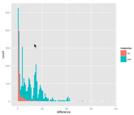
This one stacks the 'yes' and 'no' responses on top of each other which isn’t what we want as it’s difficult to compare the two.
What we need is the http://docs.ggplot2.org/0.9.3.1/facet_wrap.html function which allows us to generate multiple charts grouped by key. We’ll group by 'response':
</p>
ggplot(allRSVPs, aes(x = difference, fill=response)) +
  geom_bar(binwidth=1) +
  facet_wrap(~ response, nrow=2, ncol=1)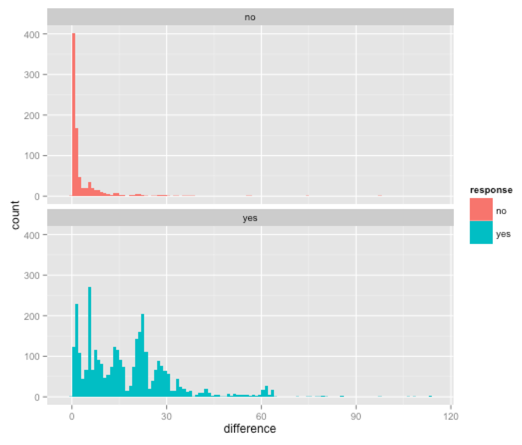
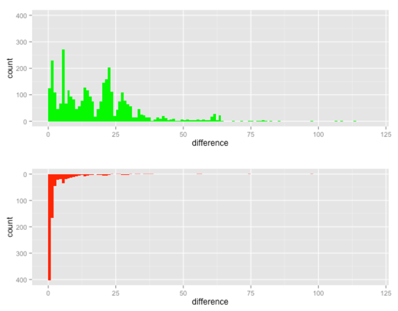
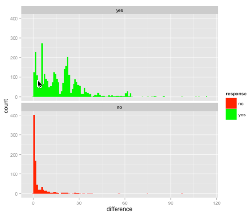
The only thing we’re missing now is the red and green colours which is where the http://docs.ggplot2.org/0.9.3.1/scale_manual.html[scale_fill_manual] function comes in handy: ~r ggplot(allRSVPs, aes(x = difference, fill=response)) + scale_fill_manual(values=c("#FF0000", "#00FF00")) + geom_bar(binwidth=1) + facet_wrap(~ response, nrow=2, ncol=1) ~
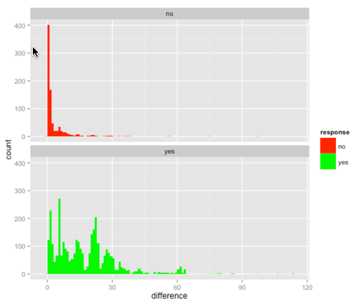
If we want to show the 'yes' chart on top we can pass in an extra parameter to facet_wrap to change where it places the highest value: ~r ggplot(allRSVPs, aes(x = difference, fill=response)) + scale_fill_manual(values=c("#FF0000", "#00FF00")) + geom_bar(binwidth=1) + facet_wrap(~ response, nrow=2, ncol=1, as.table = FALSE) ~
We could go one step further and group by response and day. First let’s add a 'day' column to our data frame: ~r allRSVPs$dayOfWeek = format(allRSVPs$eventTime, "%A") ~
And now let’s plot the charts using both columns: ~r ggplot(allRSVPs, aes(x = difference, fill=response)) + scale_fill_manual(values=c("#FF0000", "#00FF00")) + geom_bar(binwidth=1) + facet_wrap(~ response + dayOfWeek, as.table = FALSE) ~
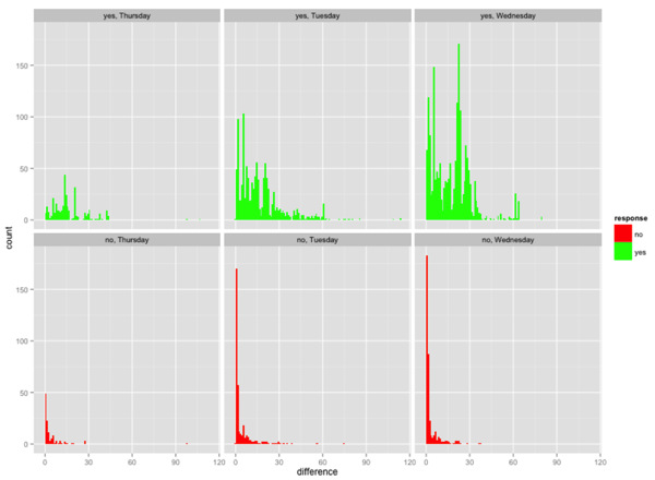
The distribution of dropouts looks fairly similar for all the days - Thursday is just at an order of magnitude below the other days because we haven’t run many events on Thursdays so far.
At a glance it doesn’t appear that so many people sign up for Thursday events on the day or one day before.
One potential hypothesis is that people have things planned for Thursday whereas they decide more last minute what to do on the other days.
We’ll have to run some more events on Thursdays to see whether that trend holds out.
The code is on github if you want to play with it
About the author
I'm currently working on short form content at ClickHouse. I publish short 5 minute videos showing how to solve data problems on YouTube @LearnDataWithMark. I previously worked on graph analytics at Neo4j, where I also co-authored the O'Reilly Graph Algorithms Book with Amy Hodler.